“O” my goodness.
Fortera is a force for positive change.

Going All In
For Fortera Credit Union, rebranding wasn’t about upping the overall aesthetic of the identity or creating better, more flexible assets for a digital-first reality. It was about signaling change, aligning employees and boldy differentiating themselves from their competition. It was to create energy and momentum for their ascent to the next level.
Agency Services
Strategy
Branding
Visual Identity
Campaign Development
Collateral Design
Branded Merchandise
Define
Fortera had been holding company-wide and executive-level meetings for months, working to define who they were, what was important to them, their goals and short and long term strategies for how to get there. We met with their leadership and polled the company to help them gain insights and achieve clarity around defining the brand.
Align
Understanding who you are is step one. Step two is getting everyone across the organization on board with the company’s vision and mission. The first group of hardcore brand ambassadors you’ve gotta make are your people. We held an internal launch of the brand to fire up all of Fortera and educate them on telling their story.
Execute
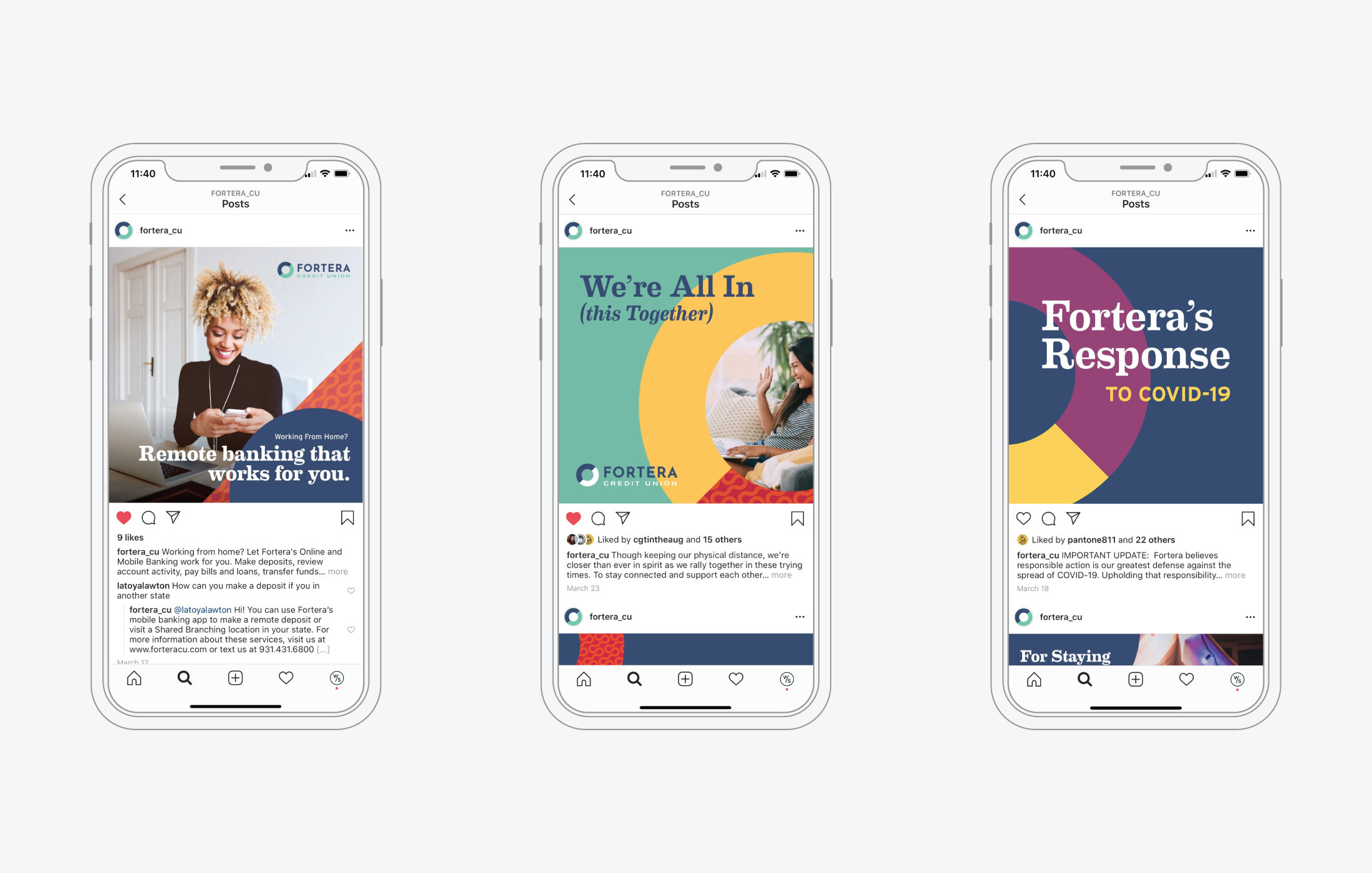
It’s time to take it to the streets. The new, dynamic, bold design around Fortera is a clear signal to our audiences that they are doing things differently. Their member-first messaging encapsulates succinctly and confidently everything we learned about Fortera in defining the brand, and we’re rolling it out across all channels and mediums.

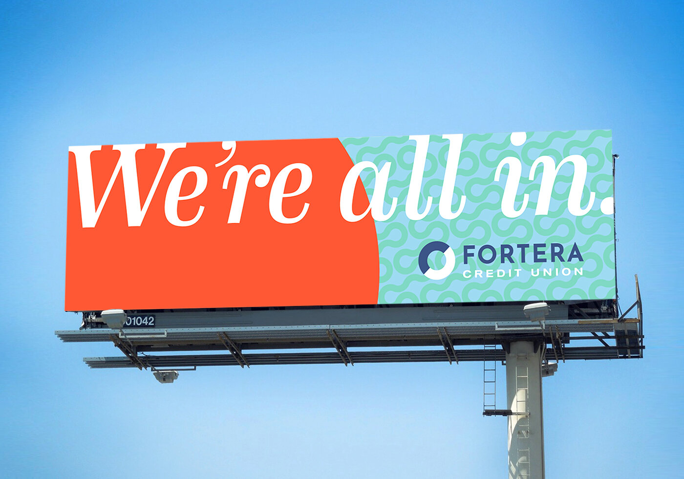
Rally Cry
Fortera’s enthusiasm for its members and community, and the cooperative spirit of the credit union are the inspiration for “We’re All In.” It’s an internal mantra for Fortera, touting their commitment to their goals that also works externally as a statement of solidarity with their audience.


Bold Meets Sophisticated.
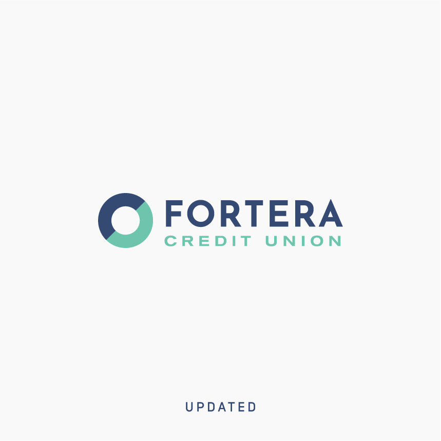
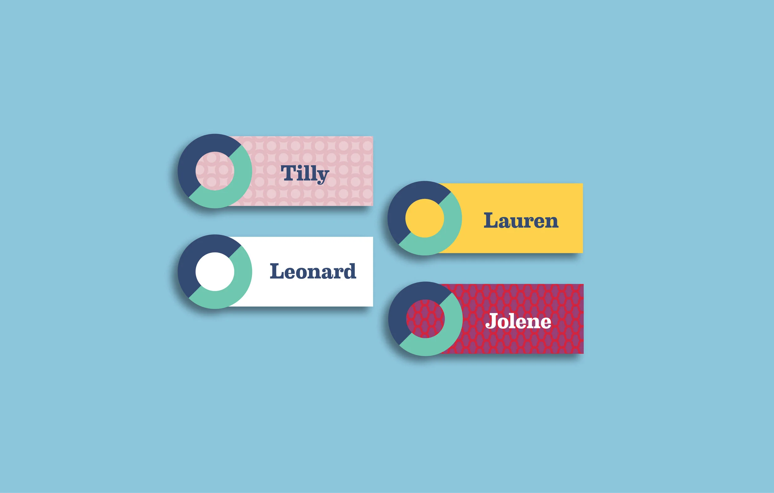
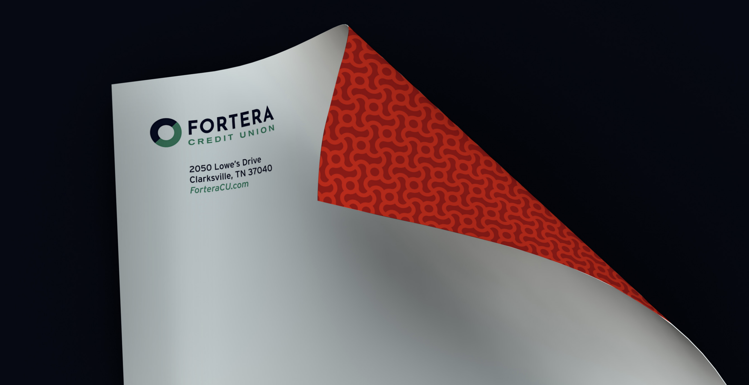
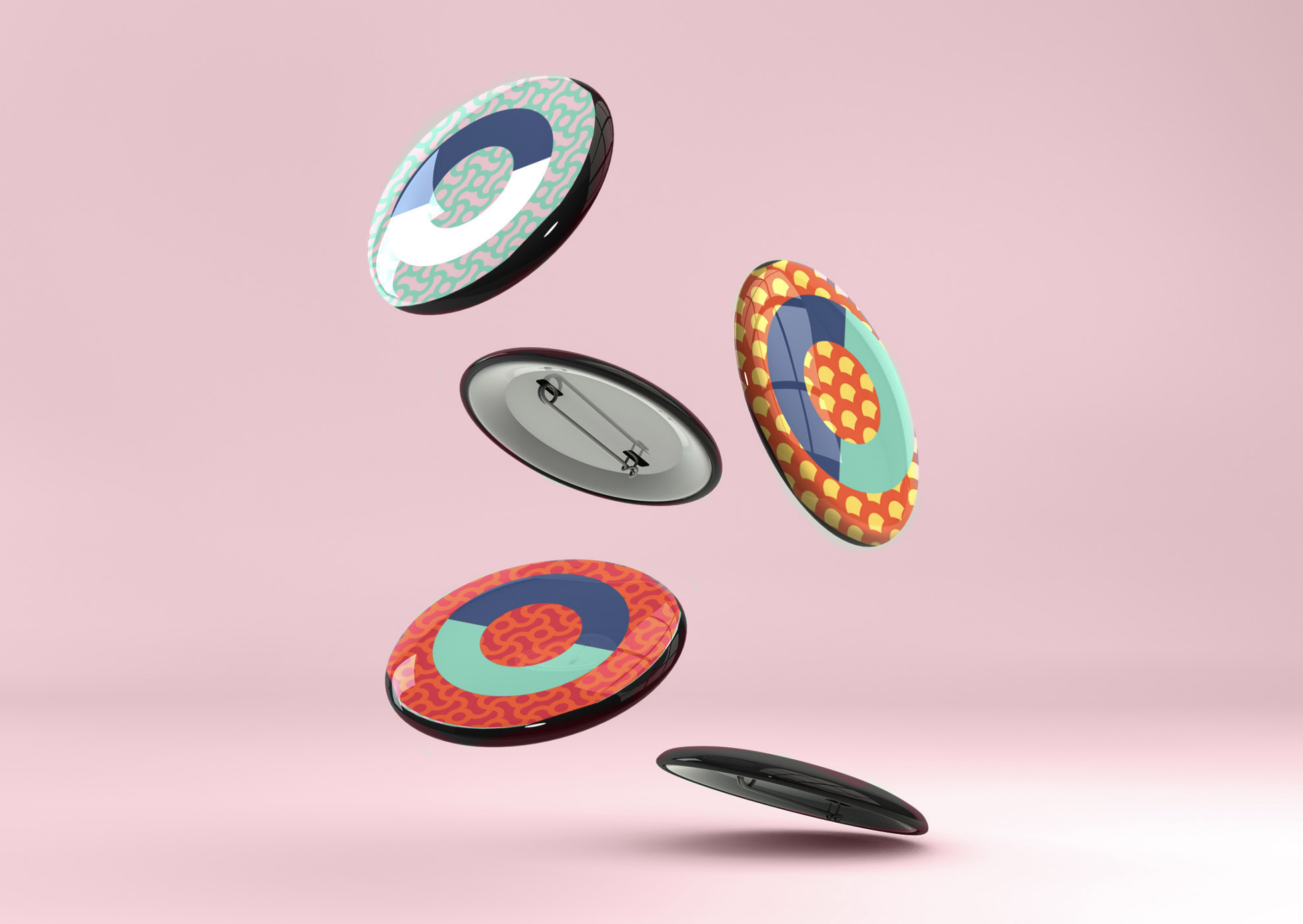
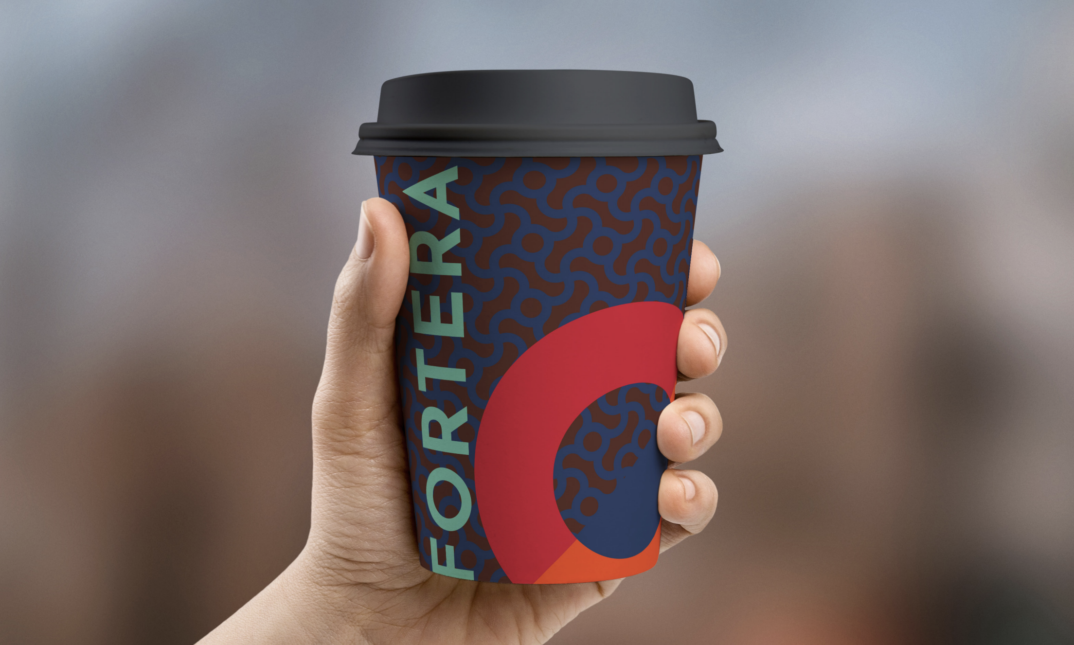
The redesigned ‘O’ icon is simple, meaningful, and useable across a wide variety of media. It was born from Fortera’s existing mark and improved to represent strength in unity. The circle is always connected, embodying the relationship between the credit union and their membership.


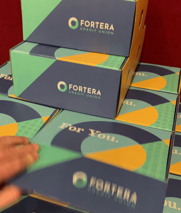
Pattern
The manifestation of the mark and our sentiment around the brand is nicely illustrated in its patterns. All built from the elemental circle of the “O”, they express class and sophistication at small scale and are bold, friendly and fun when large.

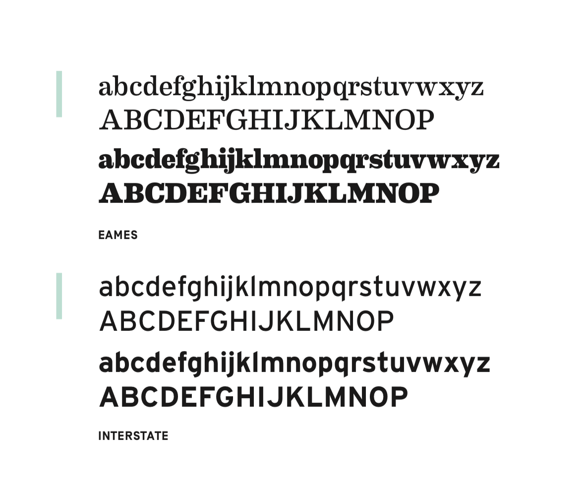
Typography
The theme of Bold & Sophisticated is succinctly evident in the type selection. Eames, friendly and expressive in heavy weights, yet studious and smart in book and light, lends the brand enormous flexibility. Interstate, a typeface developed solely for its utilitarian legibility, provides an easy, solid counter. And, it’s great for the small print.
Going Big.
Fortera Credit Union is a force for positive change. In the community, and among the membership, the mission is the improvement of lives, both financially and generally. Leadership is aligned, and employees and members are about to have a full understanding of the advantages of the credit union and the sincere, member-and-community-first place its coming from. We’re in it together. And, we’re in it to win it.

Swing Thought
The inspiration for “We’re all in” comes from two places: 1. The enthusiasm of Fortera’s leadership and employees for their members and community. It can be used as an internal rally cry and to keep everyone focused on Fortera’s missional goals. 2. The pluralistic nature of the credit union. When one member takes out a mortgage, joins as a depositor or just gets an auto loan, they are only able to do so because all the other members are “in,” supporting each service. From the membership perspective, the credit union works because we’re all in. It’s the community altruistically (and enthusiastically) supporting itself. Can’t get that at the bank.


Flexibility
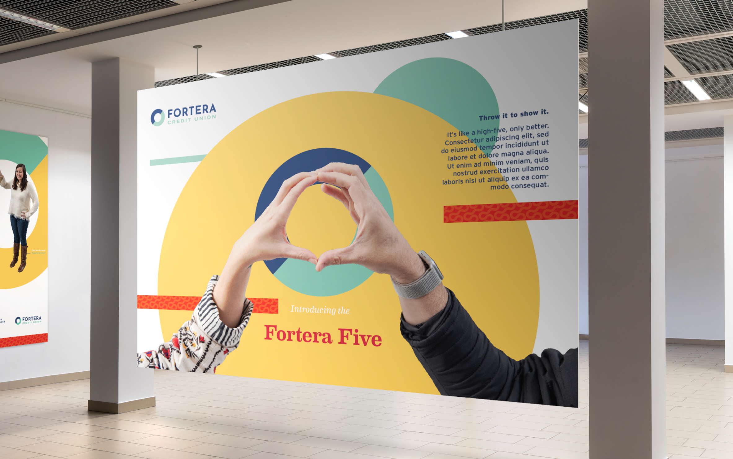
The “Fortera For” lets us highlight any of its services, products or ideals. They support small business, have home loan offerings, help people save for retirement. Any of these things, in addition to everything else they do, can all be expressed simply, occasionally with humor, and always succinctly in the “Fortera For” headline style.
Ginna Holleman, VP Marketing
“As we shared the story of this proposed partnership, we got to see exactly what a beautiful marriage and strong partnership can be.”
The Takeaway
Step one in getting people to think you’re different is actually being different and committed to it.
Perspectives
“It's been amazing to work with a partner that is so dedicated to their membership, community and employees. Their team and new brand ooze positivity and vibrancy unlike any other. I look forward to the exciting work we'll create together.”
— Christina Tucker / Director, Brand Strategy & Business Development
“Not much gets old doing what we do. That’s certainly the case when it comes to revealing a new or updated brand company-wide. Culture Day in Clarksville, Tennessee is why we do what we do. Excited to make a difference.”
— Daniel Stewart / President, COO
“The updated Fortera branding with it's bold patterns and vibrant colors is extremely flexible and definitely not boring. They could have gone stuffy with the rebrand, but instead they turned into your cool aunt. The one with the convertible.”