Bradley Schools
The Butterfly Effect.


Flight Prep.
The Bradley Schools offer preschool programs of the highest caliber, furnishing a well-researched curricula, quality care and inspiring surroundings for children in the CSRA. With a hard-to-use logo and disjointed brand holding them back from serious growth, we stepped in to clear the runway for the three Bradley Schools to exude a cohesive identity that communicates clearly their unique perspective, mission and education solutions.
Agency Services
Branding
Visual Identity
Web Design
Web Development
Collateral Design
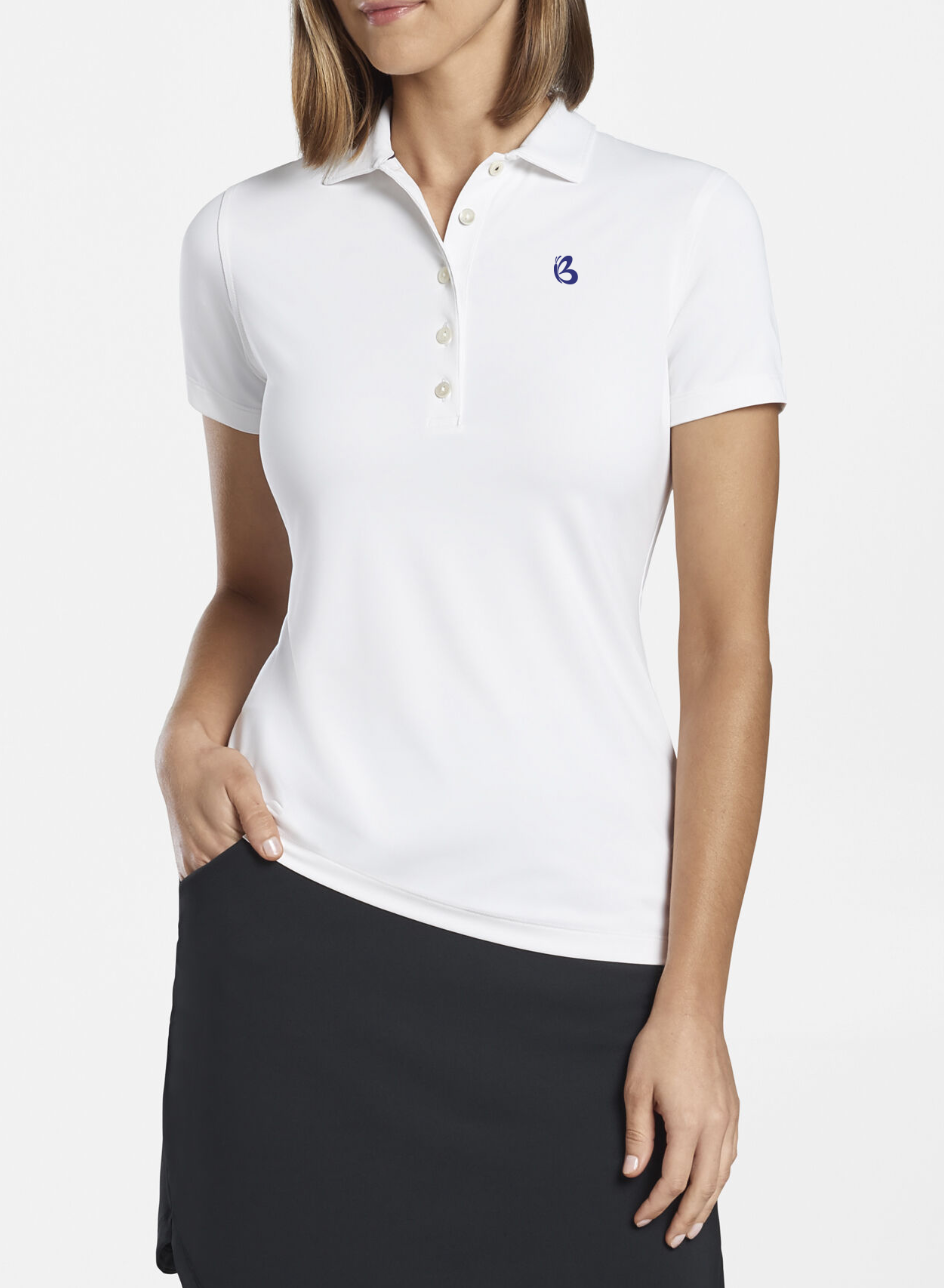
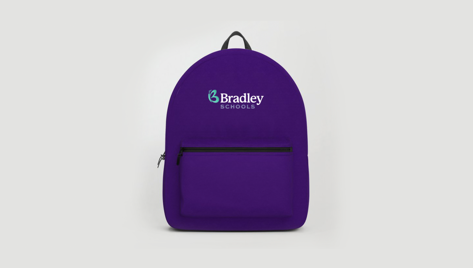
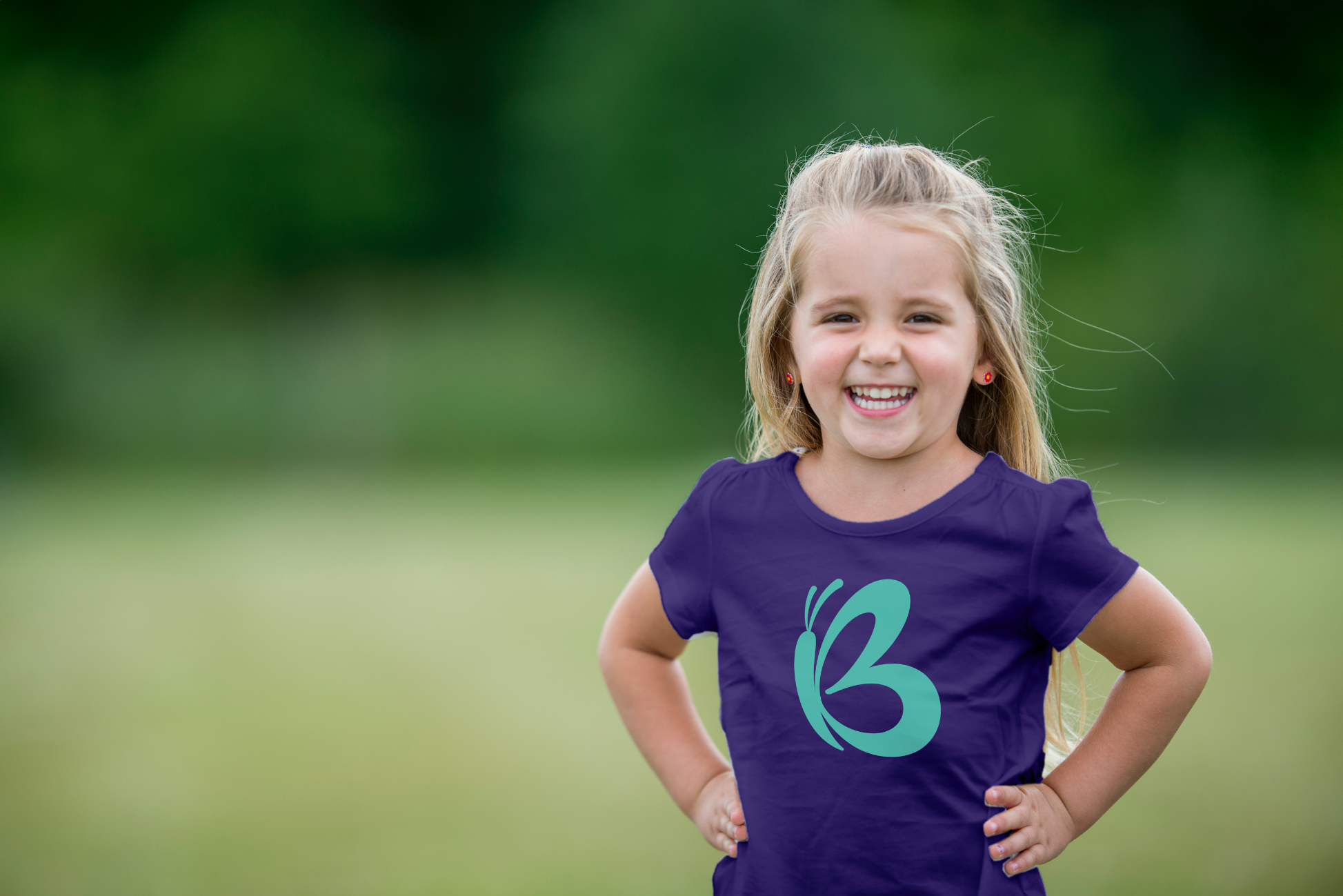
Merchandise Design
Pretty fly.
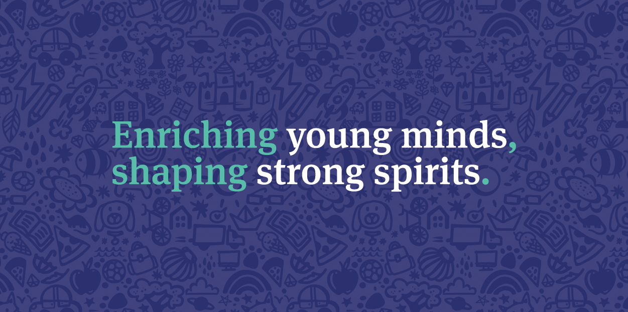
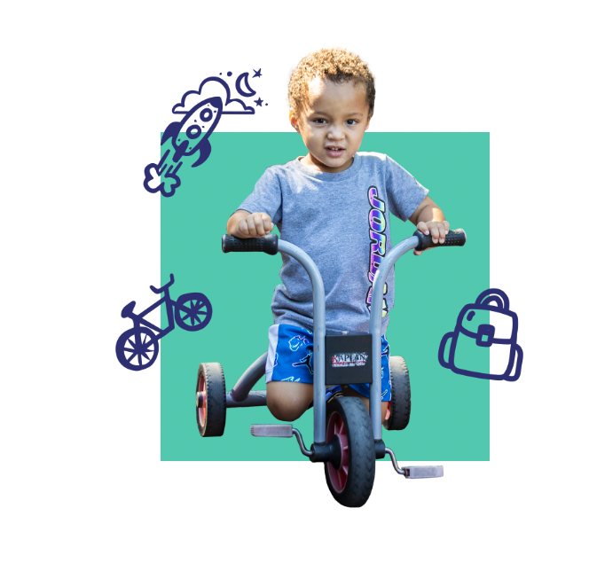
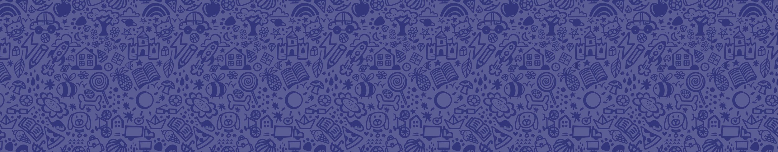
Our evolution of their identity capitalizes on their already-stellar reputation, evoking both an academic and friendly ethos. Their new pattern is chock-full of kid-styled illustrations and easter eggs, like refrigerator art, and a fresh color palette adds a memorable and unexpected flair of levity within their strong and academic brand. Oh, and we designed an equally fun and functional new website to match.
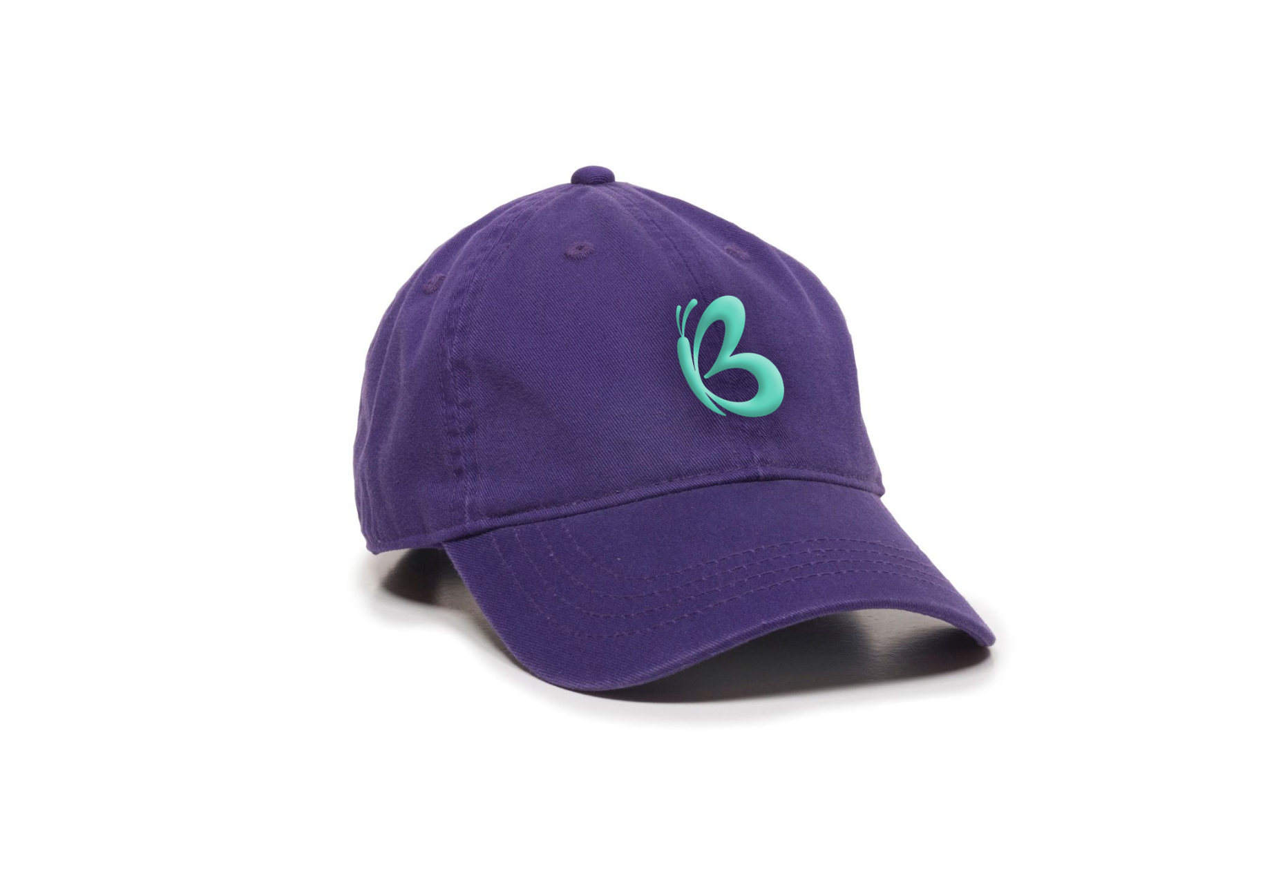
The new logo keeps the most important elements of the established brand equity—the butterfly/B, and purple, but introduces a mark that is much clearer and simpler to use. The new logo can retain legibility at much smaller sizes, important for a digital-first world.


Extending beyond the primary logo, we designed a system that incorporates a secondary mark for each school, templated to accommodate future schools that may be opened.


“The W/S team brought our brand vision to life and we are so proud to share it with families across the CSRA. The Bradley Schools emphasize learning through play—so we are thrilled to have a new website that reflects FUN! We can’t thank W/S enough for all of their efforts to create branding that is as upbeat and cheerful as our schools.”
Allison Kennedy — Executive Director


Webflight
To complement the new identity, we also updated the Bradley Schools website, increasing its user-friendliness and functionality. The site incorporates hand drawn elements and splashes of color to give it a personality distinct from competitors.
Rachel Baker – Brand Lead
“We had our work cut out for us translating the established brand and logo into a more modern aesthetic. We couldn’t be happier with the results and how the new system sets up the Bradley Schools for many years of expanded services and success.”
Anything but wingin’ it.

The Takeaway
We gotta say.
“The colors and patterns for his brand are fun and playful, perfectly representing the kind of environment kids thrive in. I loved working with the Bradley Schools administration to help this brand and website take flight.”
— Sarah Maffetone / Senior Account Manager
“It was fun to work on a site that conveys professionalism but also childlike whimsy. Trying to match the hand-drawn icons on page elements and keep everything responsive was a small challenge at times but their inclusion just adds to the overall site.”