When it comes to feeding the community,
Golden Rules.

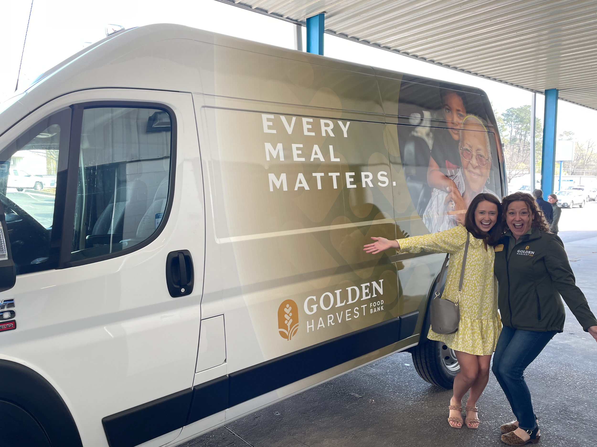
Every Meal Matters.
Golden Harvest Food Bank provides immediate resources for individuals and families experiencing food insecurity and has developed an actionable plan to address hunger in our community long term. Through leading and collaborating with an extensive network of trusted partners, resource providers, volunteers and donors, the Golden Harvest Food Bank is able to empower individuals and families by providing them with the most essential basic need in order to help them navigate and overcome unexpected hardships.
Agency Services
Strategic Positioning
Brand Development
Visual Identity
Campaign Development
Video Content
Collateral Design
Merchandise Design
Big Problem. Bigger Solution.
Golden Harvest is a big organization – a logistical juggernaut with broad community support, excellent resources and a faith-based mission – to end the ubiquitous nature of hunger in our area. After 40 years of growth, we still haven’t. Why? The simple fact is that every single day brings a new onslaught of those who need help. That’s why we sought to write their story large - their audience needs to understand how crucial their services are - because every family and every life matters. At the end of the day, every meal matters, because each brings us closer to ending hunger in our community.
More Bank For Your Buck.
It’s the dawn of a new era for Golden Harvest. We needed to distinguish their role as a food bank, distinct from a food pantry. We kept their incredible stats front and center and communicated their amazing multiplication of resources on the donor side. We used bold, food-centric imagery and emotional language to draw the audience in, ultimately educating them on the importance of Golden Harvest’s mission and just how elite and crucial an organization they are.


The Strategy
Reframe the market. It was time to address the common misconception that Golden Harvest Food Bank is just another place where you drop off (or pick up) canned goods. It isn’t just a place to donate or volunteer during the holidays. Nor is hunger is a limited issue. Food insecurity in our local area is a year-round, complex challenge. Thankfully, Golden Harvest has a plan to tackle hunger together as a community.
The Golden Harvest Food Bank consists of an entire network of team members, facilities and resources united in the mission to eradicate food insecurity. Through a robust infrastructure, the team is able to maximize every opportunity, yield efficiency and multiply nutritious food goods in order to help as many individuals in need as possible.
Whether someone is on the giving or receiving end of this network, any and every individual who chooses to engage with this rock-solid organization realizes an immediate, positive impact.
“We are grateful for the inventive minds at Wier / Stewart who took our mission and goals and brought them to life through our new logo, colors, and tagline. So much time and respect were given to our 40-year brand, and we look forward to using this new branding to further our mission of ending hunger in our area.”
— Abby Muehlfeld, Vice President of Marketing – Golden Harvest Food Bank

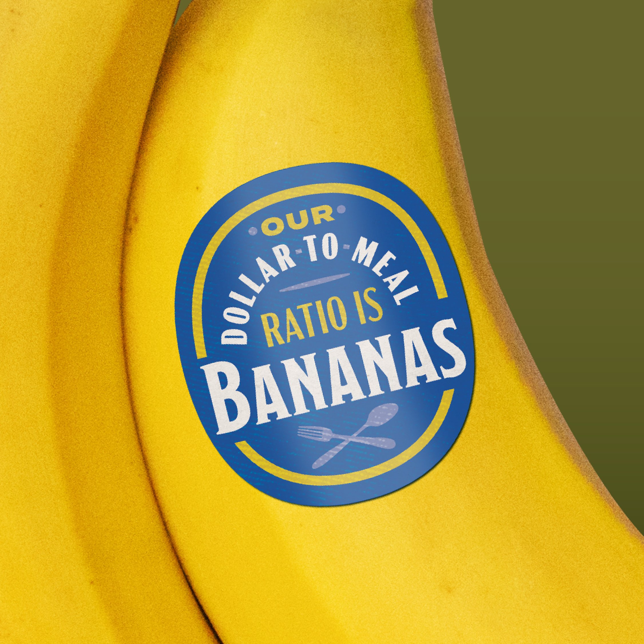
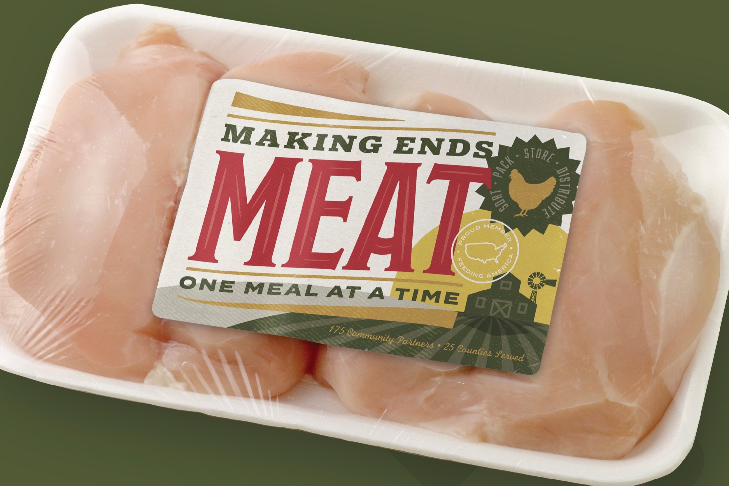
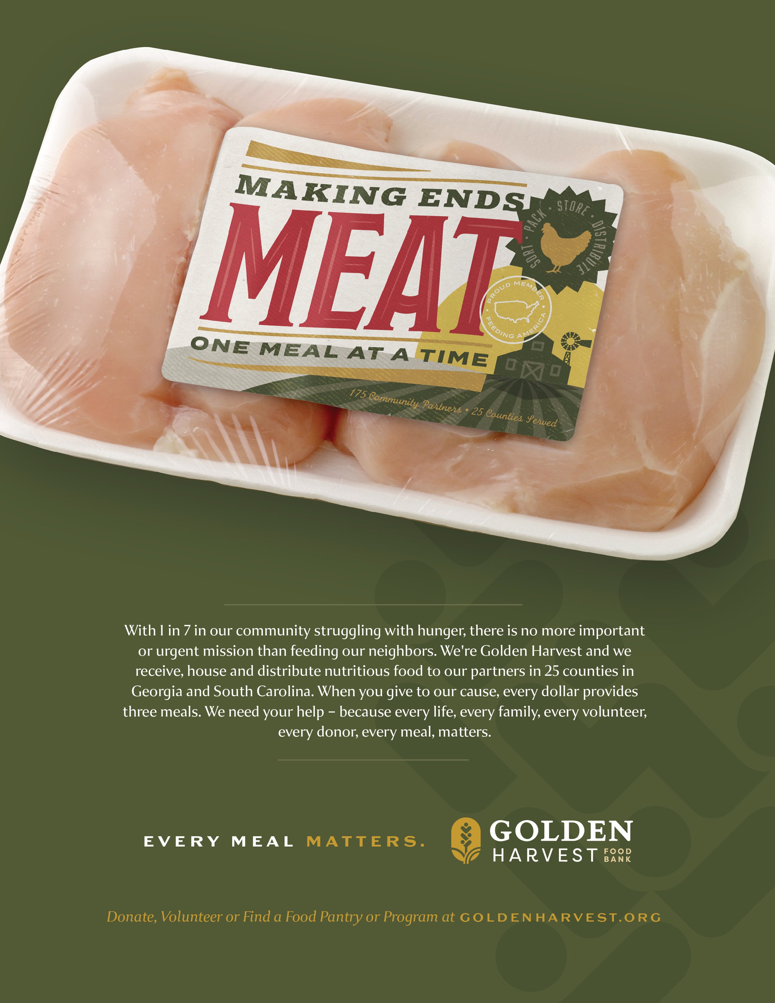
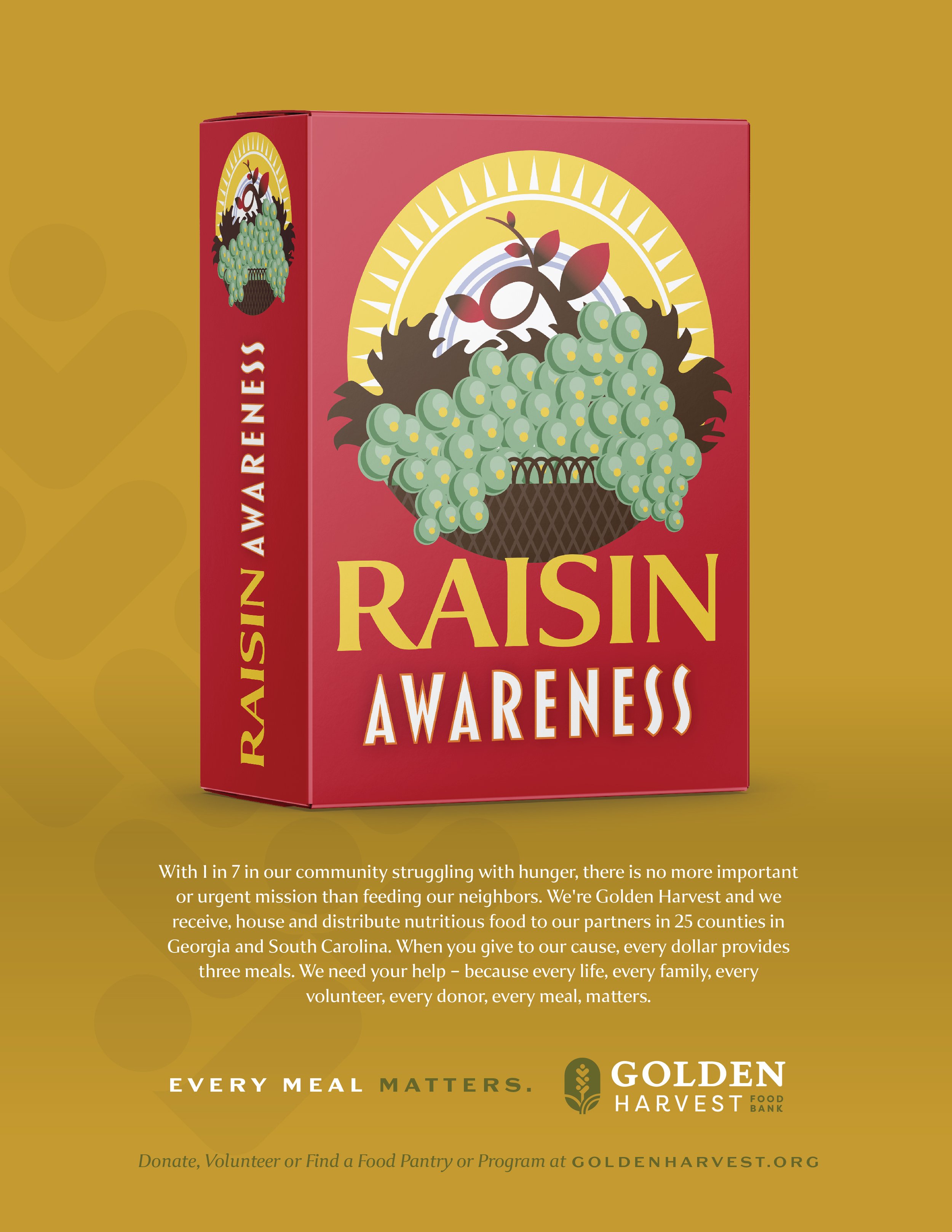
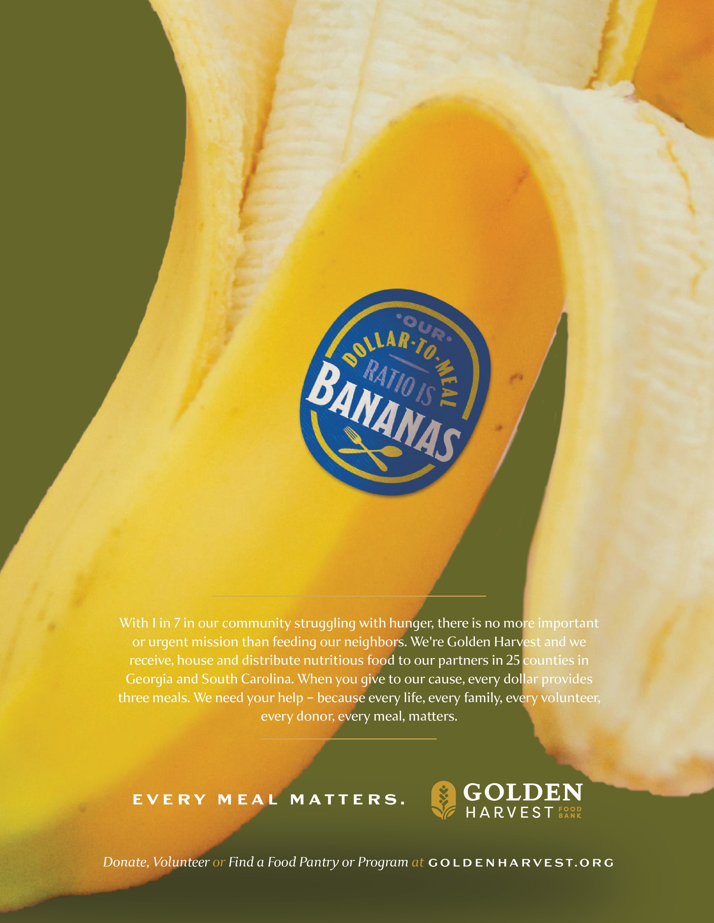
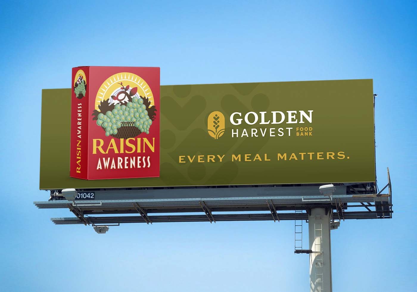
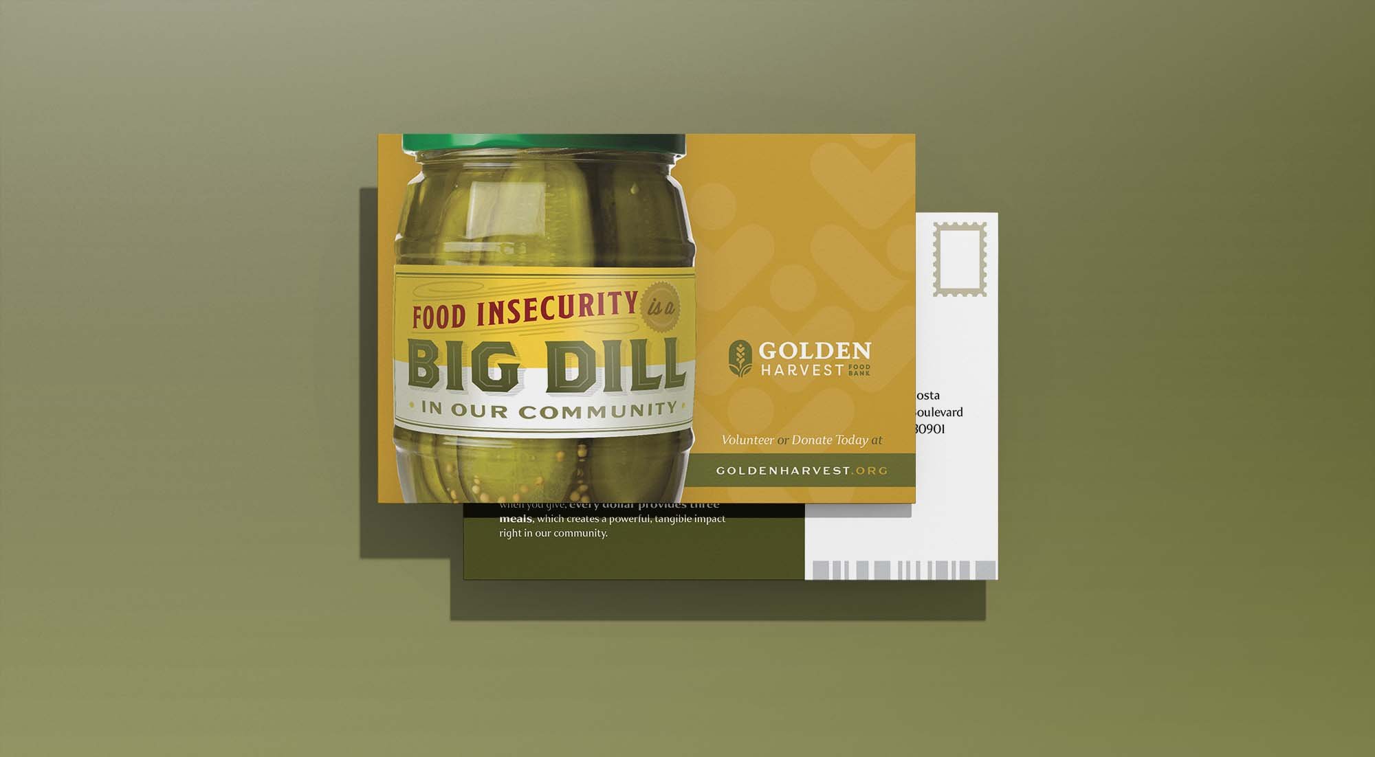
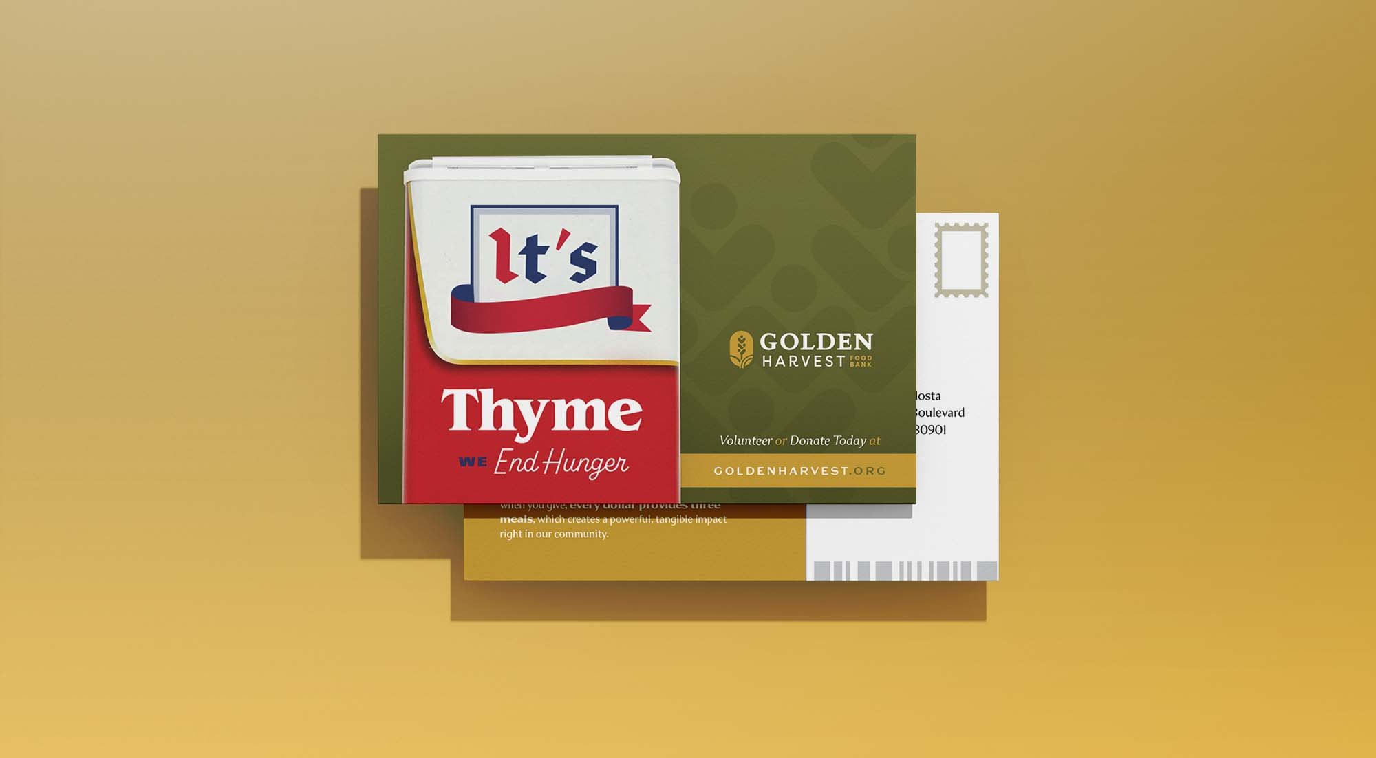
Pun-Believable
Print ads (especially full page ones) allow us a great opportunity to convey our highest-level message and support it with focused, key differentiators. Here, we can also include contact info and strong calls to action.

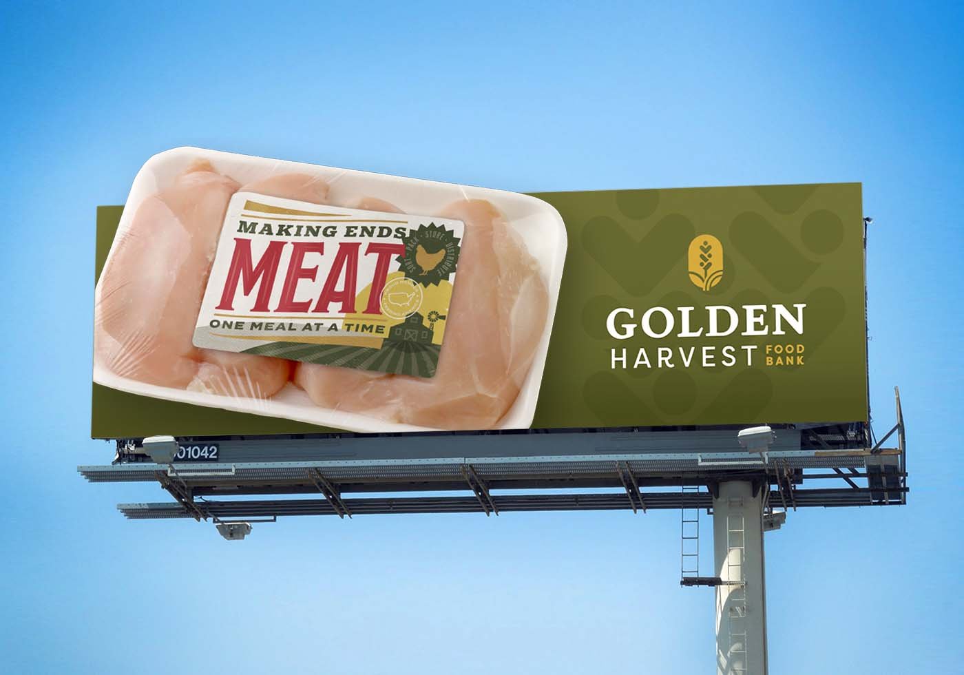

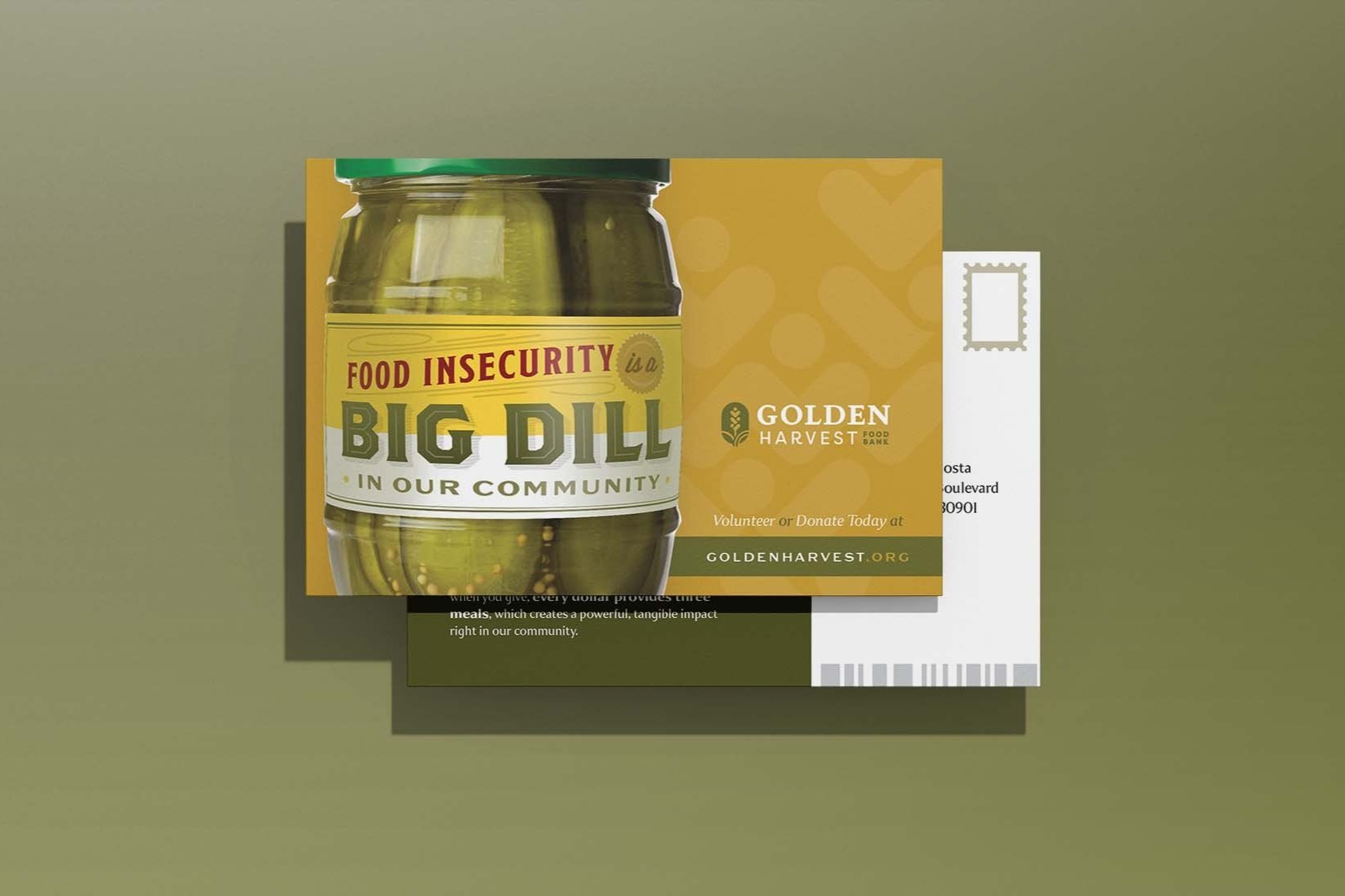
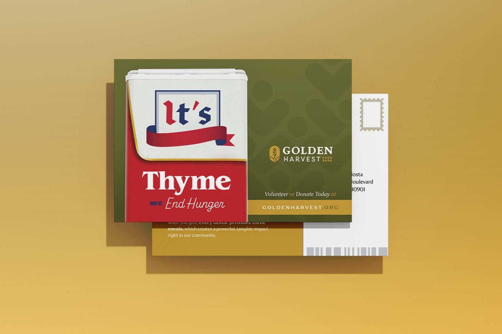
Special Delivery
Whether digital or traditional mediums, our brand campaign needed to work seamlessly across various channels. Turns out, eye-catching creative has stopping power whether in-feed or in your mailbox.
The Brand

Brand New
Golden Harvest is doing God’s work. This labor of love, now going on 40 years, has fed the hungry, rallied our communities, and constantly expanded to help even more of those that need it. The men, women and children who volunteer and donate make our efforts possible - it’s their love and their generosity that feeds our organization. This fact, coupled with our position as the heart of food distribution, led to our evolution of the brand, expressing both the function and the passion of our mission. It’s optimistic and joyful. It’s humble and smart.
An Organization with Heart.
At the end of the day, our mission to feed the hungry requires both many willing hands and a many hopeful hearts. Here, we honor both.


Color
The color palette is based on natural food colorings made from fruits, vegetables, and roots. This gives us tremendous flexibility in expressing the brand and keeps our communications colorful and bright. And, to tie into the equity from our former mark, we’ve kept our familiar lead colors.


Typography
The display typeface for Golden Harvest, Sweet Gothic, is elegant and serious, adding gravitas to the tagline “Every Meal Matters” and the weightiness of the issue of hunger. Its contrasting body font, Baskerville, is a classic that gives Golden Harvest an established and evergreen feel (which it is).

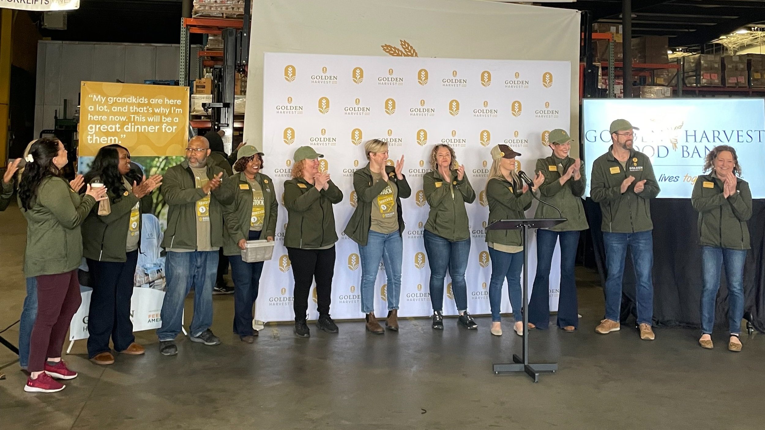
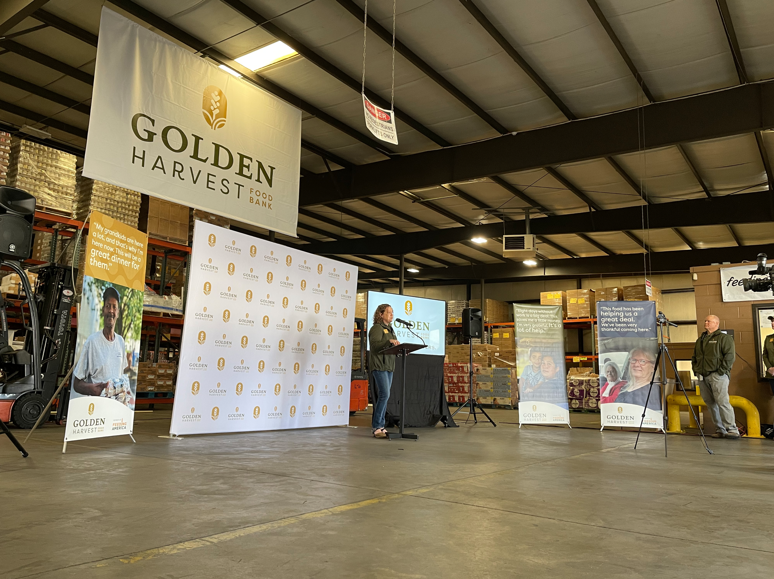
The Brand Launch
Execution is everything. The new brand signifies a new era in the organization’s history. It was important to give the new look and message a moment at center stage as the Golden Harvest team revealed the work to the community and external stakeholders.

Amy Breitmann, President & CEO – Golden Harvest Food Bank
“The new look has a nod toward our past yet communicates the large scope of logistics involved in serving more than 12 million meals a year, while representing our passionate belief that every meal, volunteer, donor, partner and employee matters. We would like to thank @WierStewart for the incredible creative work behind our new brand and messaging!”

The Takeaway
That was fulfilling.
We gotta say.
“This has been one of the most exciting (and eye opening) projects I've been a part of here at WS. From learning the 40-year history of Golden Harvest Food Bank, to touring their facilities, to feeling the joy that comes from each of their employees/volunteers, to seeing first-hand the impact they are making in our community and the goals they have for ending food insecurity in our community - they are living out their mission day in and day out. This rebrand truly embodies Golden Harvest Food Bank, past, present, AND future!”
— Abby Paul / Account Manager
“Tapping into the ubiquitous language of food packaging was a fun way to create a campaign that feels instantly familiar. The visuals help clarify Golden Harvest’s core mission of receiving and distributing food, with humor that highlights their personality and positive outlook on solving this all-too-widespread problem.”