Columbia Ventures creates
A Great Place to Land.

Come fly with me.
Apartments in Atlanta? What a novel idea. Actually, when Columbia Ventures came to us about their latest development in Edgewood, it was a novel idea.
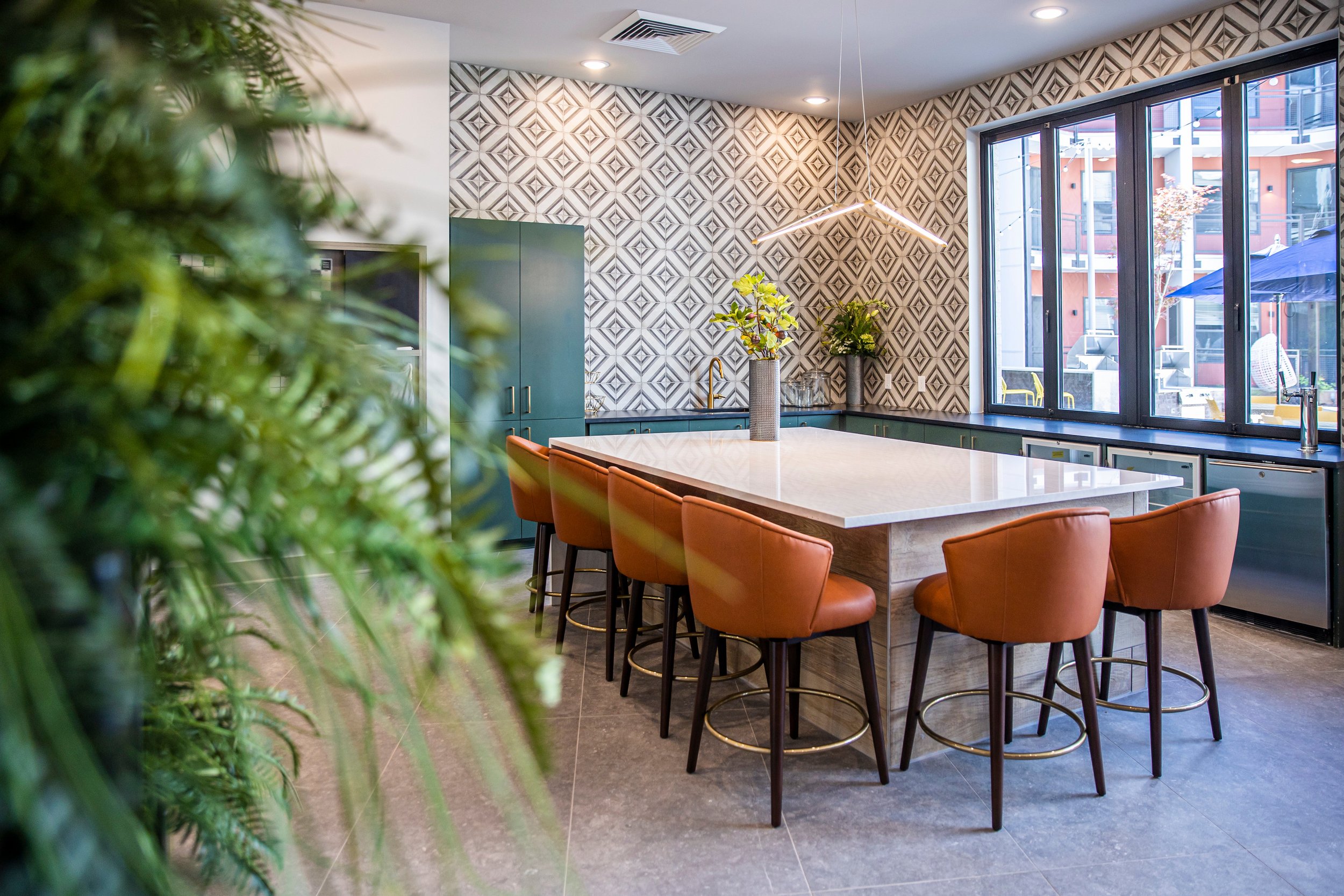
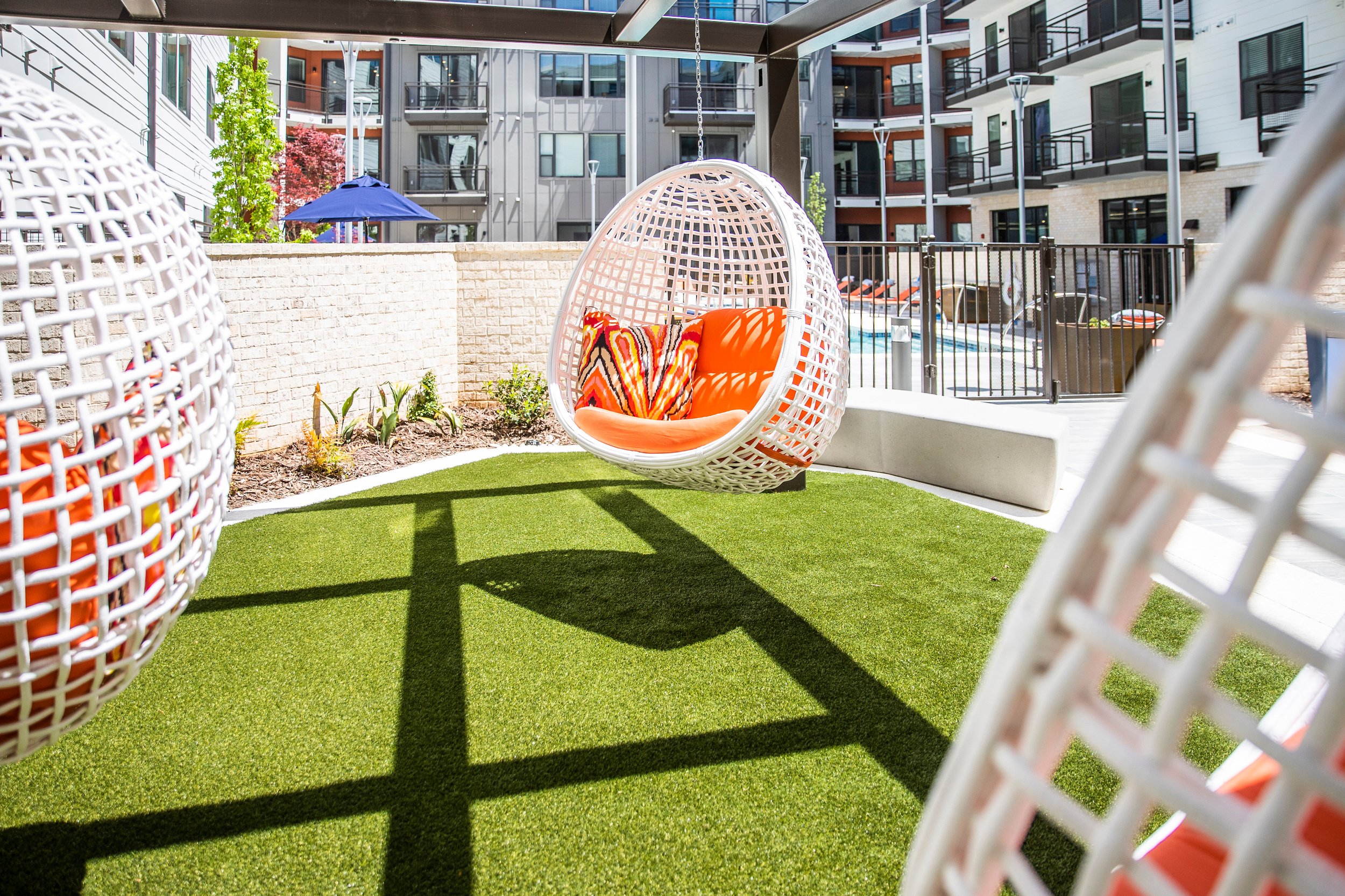
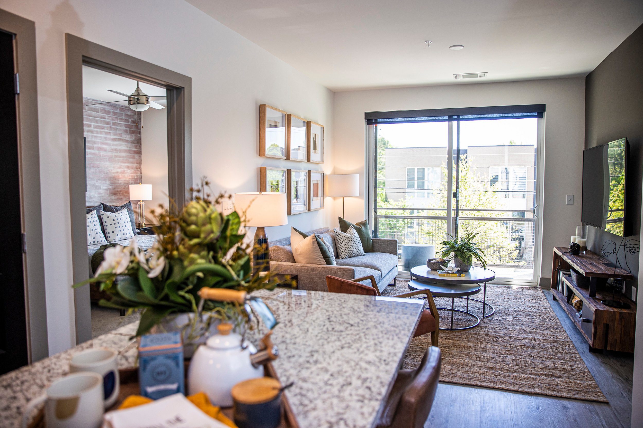
Columbia Ventures wanted to continue building out their footprint in the Edgewood neighborhood, but instead of another “built for everyone” complex, they decide to take a more boutique route, developing a property that met the needs and wants of the neighborhood. Focusing on smaller units with less square footage, yet higher-value, amenities, at an accessible price, gave us an audience looking to pay a value price for a superior quality of life.
Agency Services
Strategy
Media & Marketing Plans
Branding
Visual Identity
Campaign Development
Paid Media
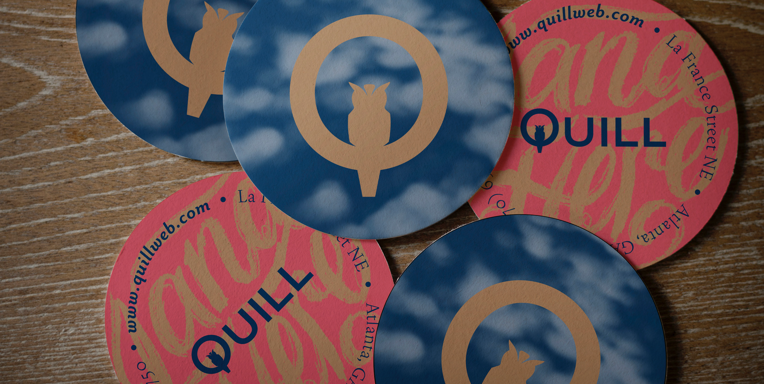
Collateral Design
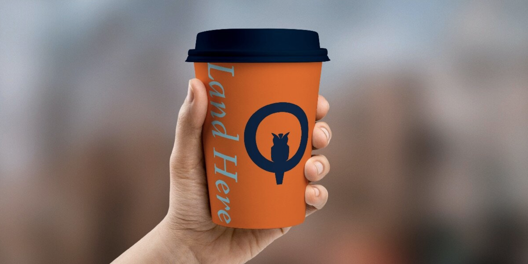
Merchandise Design
Website Design
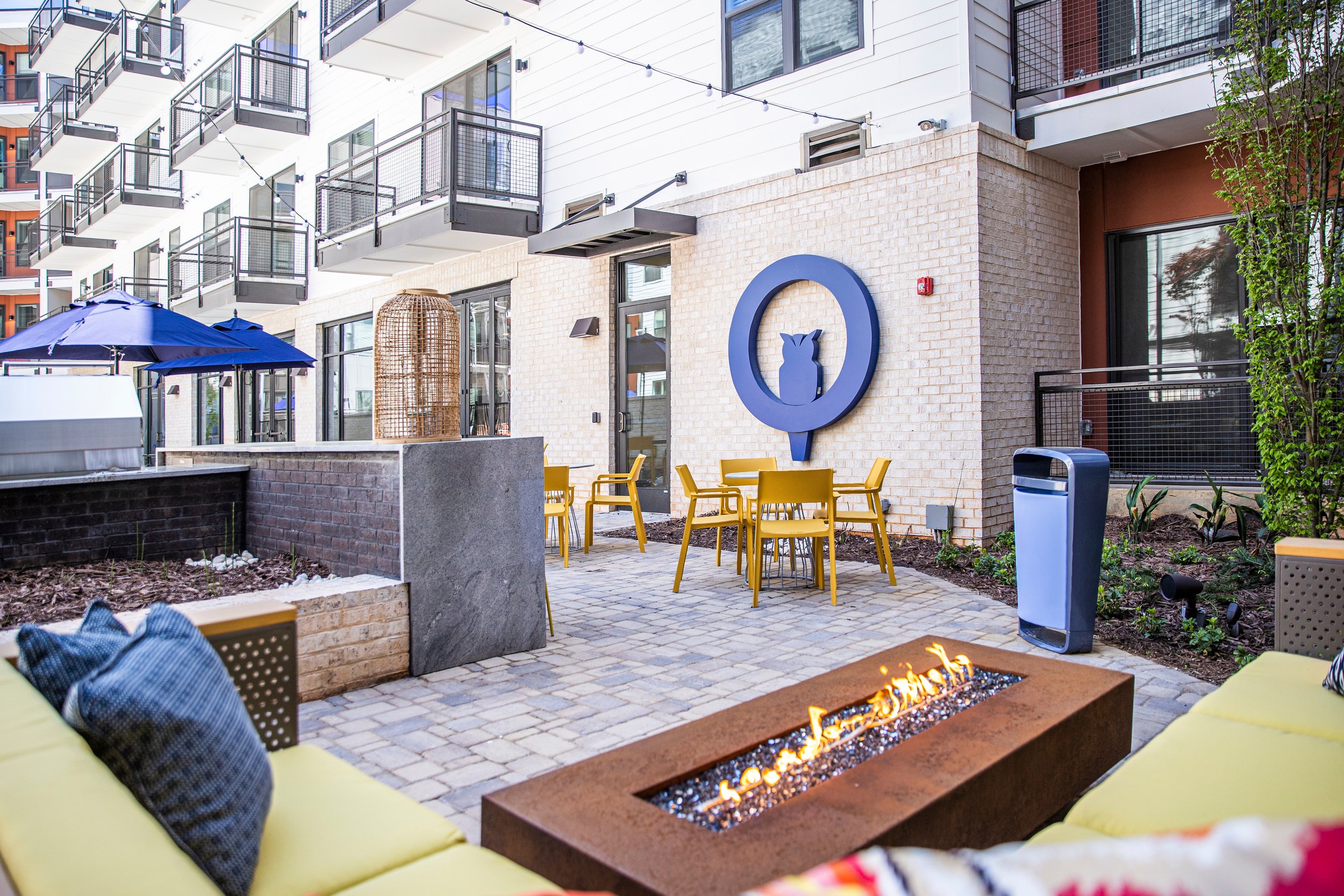
Birds of a Feather
Just as construction on Quill had to start from the ground up, so did their marketing. With everything from finding a name that tied back to the neighborhood’s past to building a website where users could actively search for listing availability, everything had to be done.
Time to Take Flight
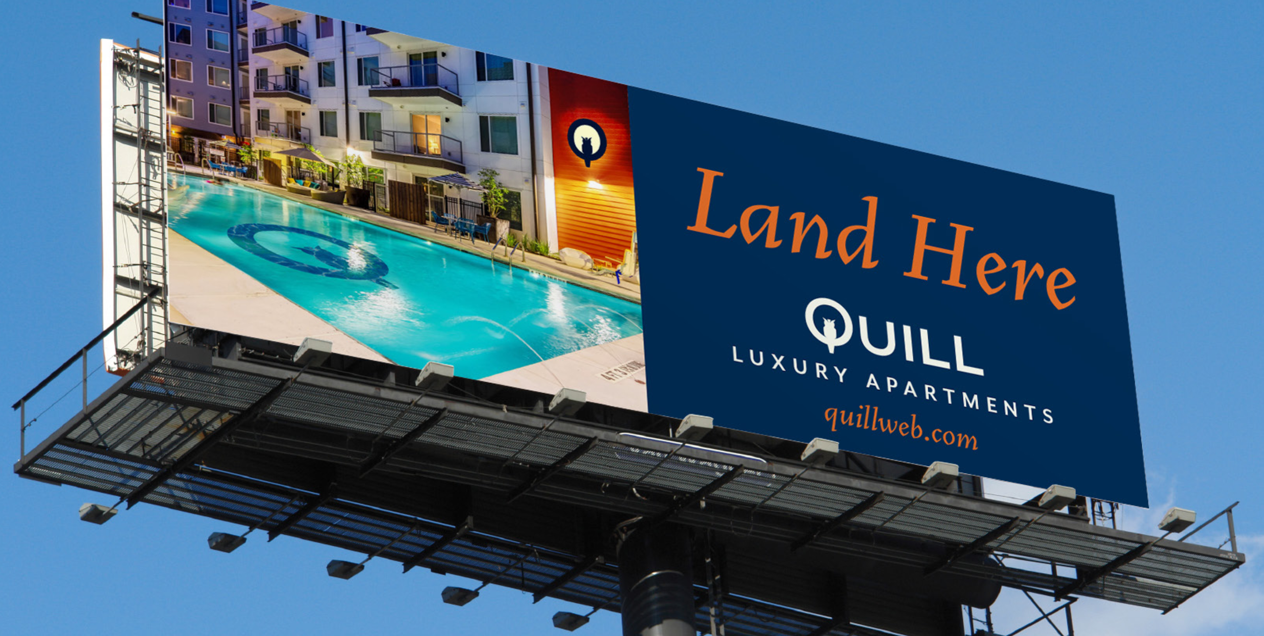
After laying the foundation, we had to focus on getting the message out there; Quill was here and ready for new residents. It took a strategic and coordinated strike to debut Quill to the community. We rolled out an awareness campaign designed to tell Quill’s story and position them as different (and better) than the competition, across multiple platforms, channels and tactics.
The Strategy
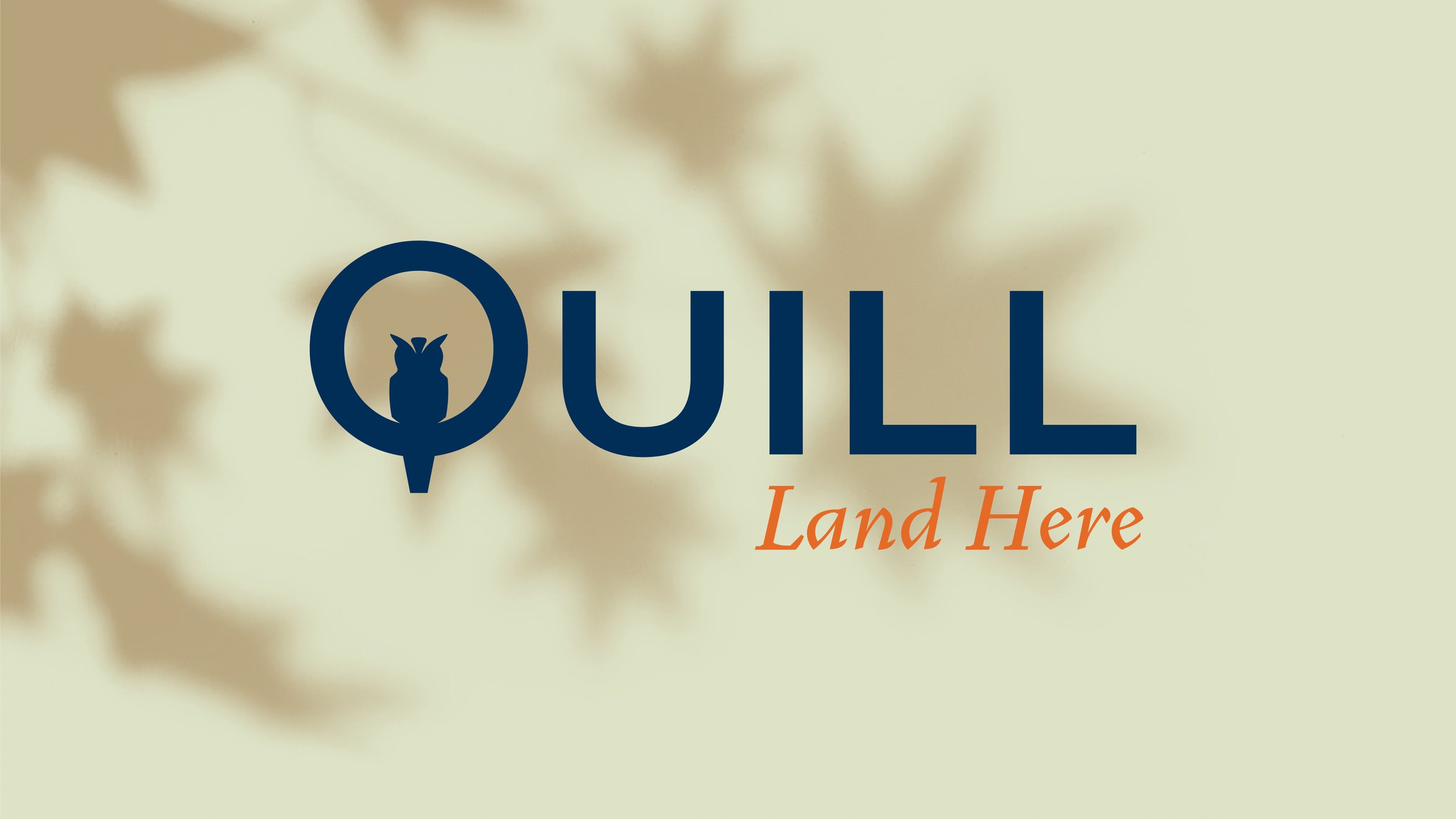
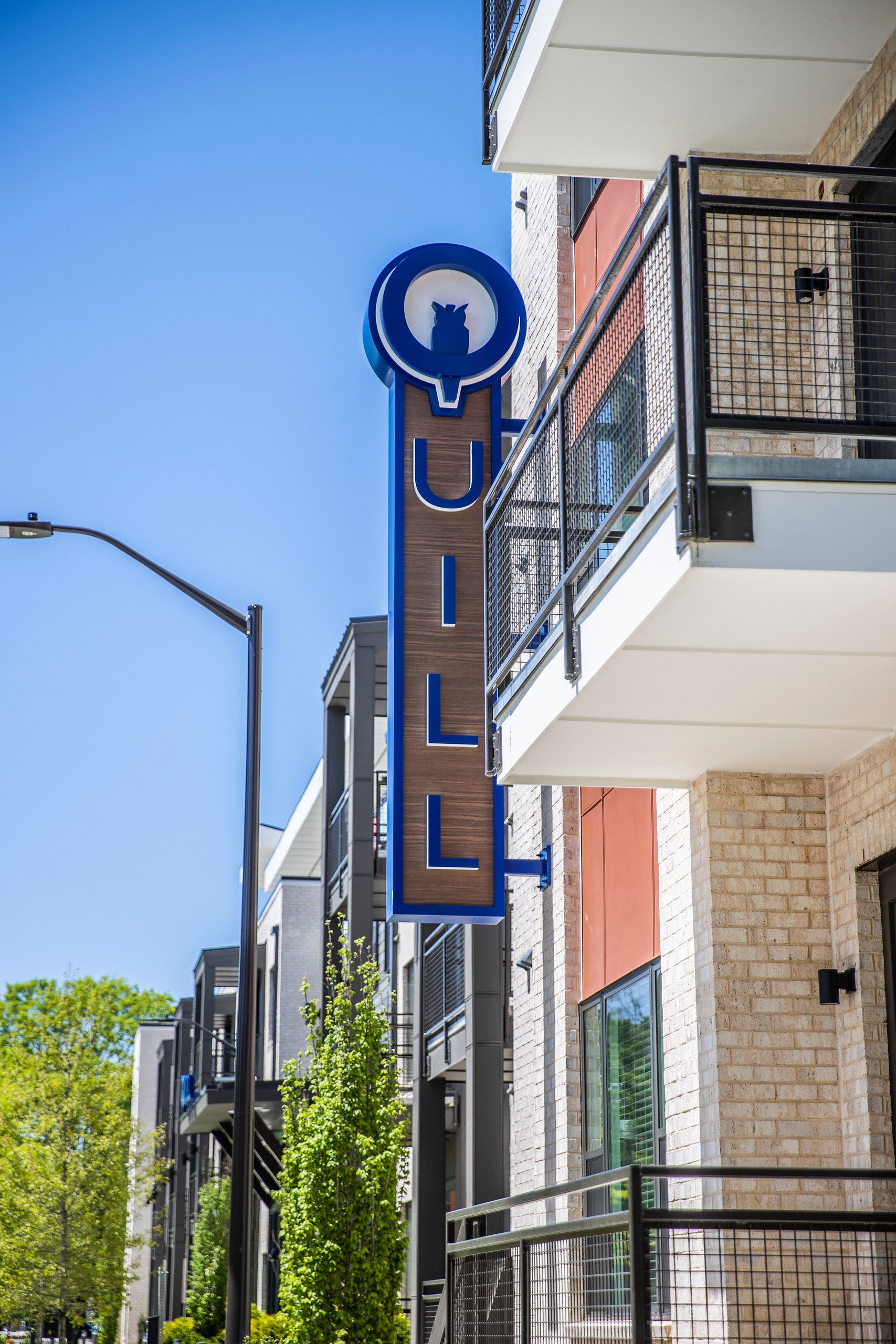
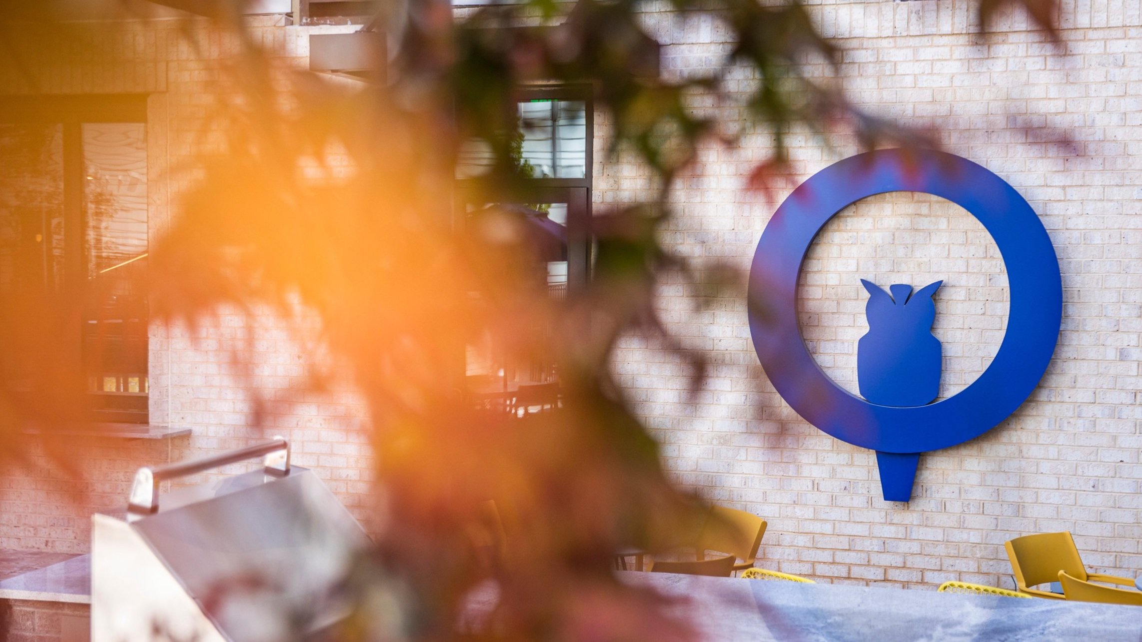
When naming the project, we went for something that would speak to the history of the neighborhood and its residents. In our research, we noticed that folks had adopted a mascot: the owl. From there it was an easy jump to Quill, some might say less than a day as the...owl flies.
Quill is the main part of the feather, also colloquially "the pen" or "writing", causing this name to be the perfect cross-over of the artsy-ness and history of the neighborhood.


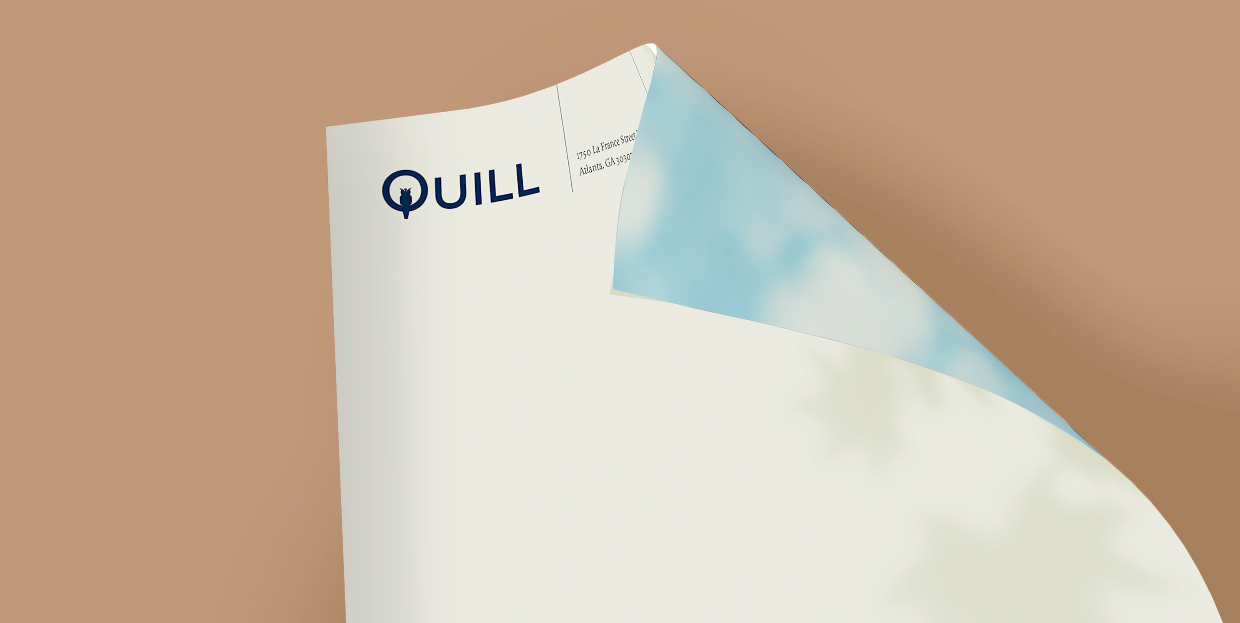
Creating The Brand
With a great name like Quill we had a lot of unique design paths to explore. Our identity continues paying homage to the neighborhood's artsy vibes, while nodding to the modernism of the dwellings and subtly touting the Edgewood mascot.


A bird in the hand.
Knowing our audience for Quill would be viewing the site overwhelmingly on mobile, we built it from the ground up with that in mind. Subtle actions make for a very nice UX, imploring our visitors to explore and spend more time on the site. As pre-leasing begins, we're positioning Quill as one of Atlanta's best places to land.


Bringing The Traffic
Over the course of a three-month campaign, we harnessed paid media efforts to drive qualified traffic to Quill’s website with the goal of generating interest in the community’s offerings. Through top-funnel awareness tactics such as YouTube advertising, middle funnel approaches including social media prospecting, and lower funnel techniques such as retargeting ads, paid media helped customers travel from the beginning of their journey learning about Quill to the end goal of inquiring about leasing a new home. With nearly 5 million impressions across tactics and strong completion rates on YouTube as well as consistent and quality clicks on the other channels, Quill saw a noticeable spike in website traffic when paid media efforts were in place.


“The W/S team blew us away with their creativity! They expertly picked up on subtle details relevant for our community, did a lot of research and presented us with a strong, creative name. They then paired it with a logo that incorporates the main symbol of the Edgewood neighborhood (the owl) and also captures the energy and vitality of the area. This resulted in the strongest logo and visual identity package we've had on any of our multifamily communities to date. Our branding is loved by our residents and our neighbors alike, and we couldn't be happier.”
Diana Stoian — Columbia Ventures


Annie Frost – Integrated Media Strategist
“Through the use of paid media tactics, we were able to hit their target audience in the Edgewood community and beyond. Whether the audience spent their time on YouTube, Facebook, Instagram or other websites, Quill branding was present as a subtle reminder to check out the new community. This not only introduced the Quill brand to the target audience, but it also drove them to learn more on the website, generating new tenants for the building and a new home for individuals and families in Atlanta.”

The Takeaway
It’s the nest best thing.
We gotta say.
“All the colors and textures are meant to evoke a fall sunset, with long evening shadows and the deep hues that arrive before night. My last few years in Atlanta I lived near Edgewood, so this project felt a little extra special to me, getting it right was key.”
— Leonard Zimmerman / Design
“We spent a lot of time researching and soaking in the style and visual motifs of railroads of all eras to create an identity system that was appropriate and eye-catching, but never 'theme-y.' We sought to convey Beacon Station's vision for vibrant urban living through bold color, pattern and type, which embrace the neighborhood's history while setting a positive tone for its exciting future.”
— Rachel Baker / Designer
“Potential residents of Quill are busy and want to easily find information about amenities, floor plans and availability. The site takes advantage of the brand's unique visual style while providing the information and tools a person expects when searching for a new place to live.”