Destination Augusta
Makin' Waves
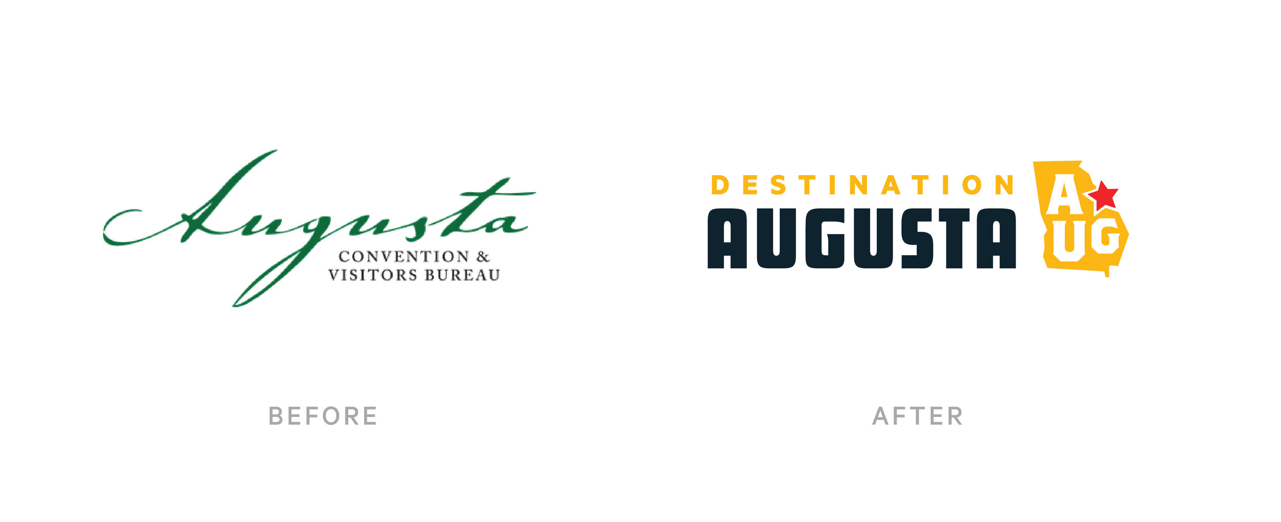
While 2020 and 2021 may not have been travel-heavy years for most, it was certainly on our mind! Over the course of the last year our team has had the opportunity to work closely with the Augusta Convention & Visitors Bureau building a new city-wide, tourism centric campaign. But the work didn't stop there—we also got to refresh the ACVB's own brand identity. Enter: Destination Augusta.
Baby, I'm a... ⭐️
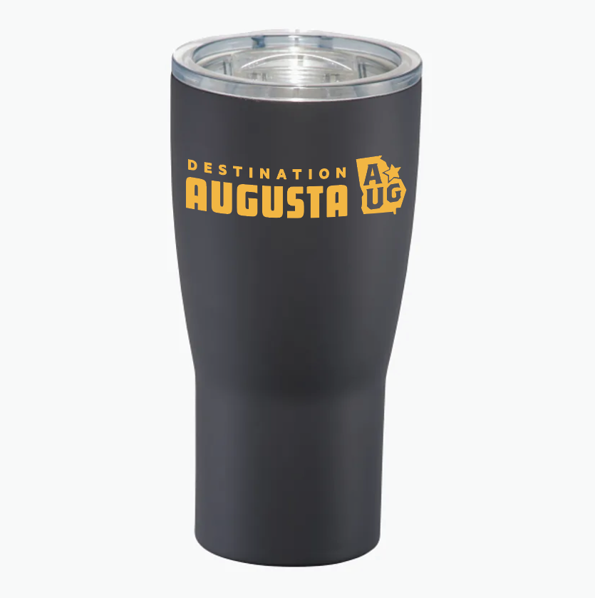
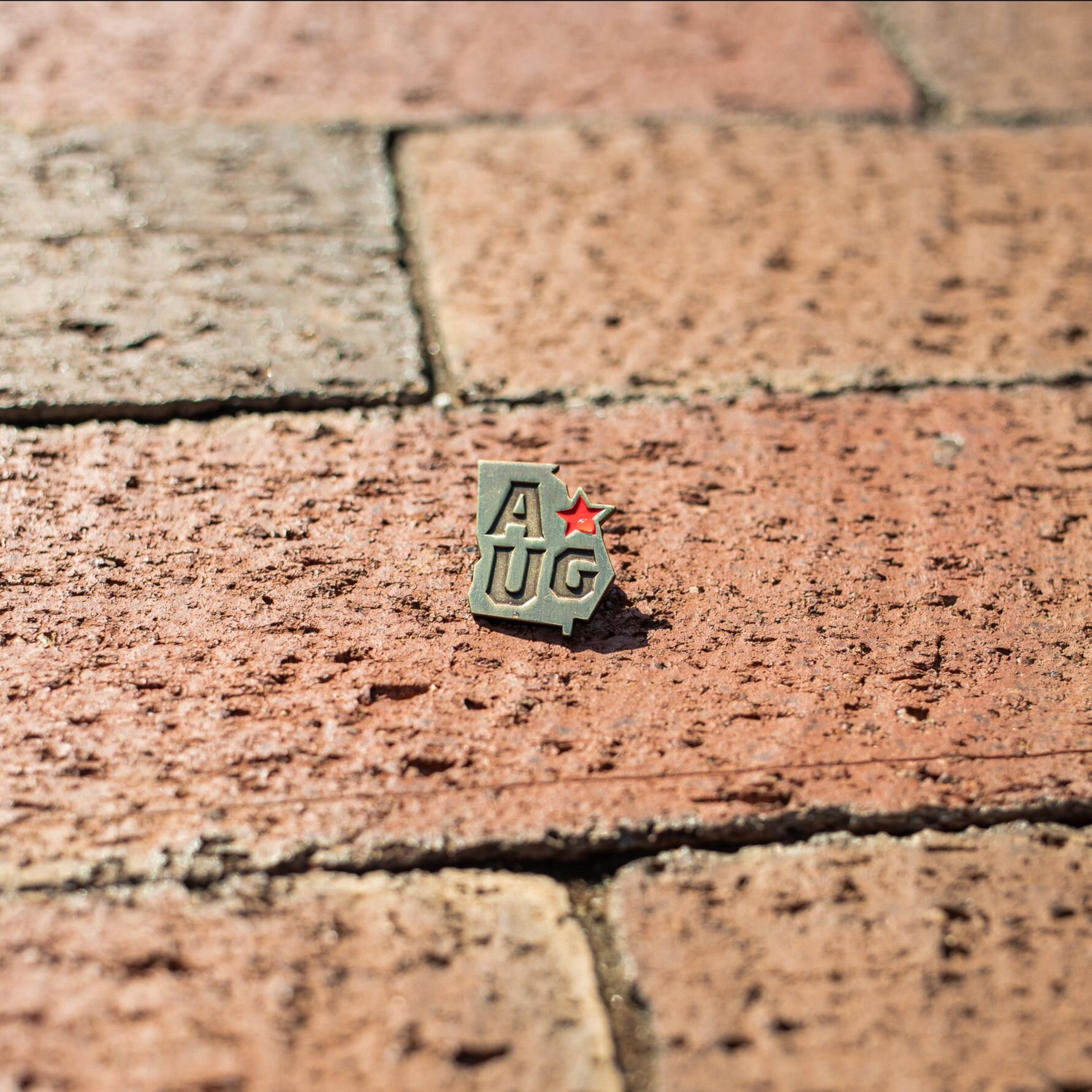
Destination Augusta, as a name, brings in a lot of excitement, energy and, frankly, fun to a brand. Working off the incredibly positive reception of our AUG bug in the tourism campaign, we incorporated it as the mark to represent the entity. It has already proven its adeptness and ability to stand alone on merch and integrating seamlessly with Destination Augusta's initiatives and supporting brands. In other words, it's a star.
"After an incredibly challenging year for the travel and tourism industry, we knew we wanted to emerge from the pandemic with a fresh, bold identity that succinctly describes what we do. Wier / Stewart made the branding process seamless, anticipating our needs. From business cards, branded folders, even lapel pins they nailed it!"
Lindsay Fruchtl / VP of Marketing
We Have Liftoff
In May, in conjunction with National Tourism Week, Destination Augusta revealed its new brand. To help catapult the brand to the community and beyond, we created an Instagram Reel showing off the new brand at a few local favorite spots. It's safe to say, with over 7,900 views, Augusta's destinations were on full display.
"The team built such a strong look for the campaign, it was easy to extrapolate a look for Destination Augusta. The look is honest, bold, fun and straightforward with some gritty rough edges...just like my hometown."
Leonard Zimmerman / Designer


