Nailed It
BlueCross BlueShield of South Carolina hired us and app downloads are in the black. See what we did there?


The Challenge
The insurance industry and all of its communications can be hard to understand, cold and just plain overwhelming. Many insurance provider communications look the same, so standing out in the clutter of emails and office flyers and then also trying to encourage downloading a new app was a tall challenge.
BlueCross BlueShield of South Carolina consulted us to develop a launch strategy and awareness campaign that communicated the value and ease of the app in an engaging way. We happily rolled up our sleeves and got to work.
Agency Services
Research & Strategy
Campaigns
Content Development
Social Content
Collateral Development
The Goals
Create awareness for the My Health Toolkit App
Encourage member downloads of the App
Tie the App back to the BCBS family of self-serve products
The Solution
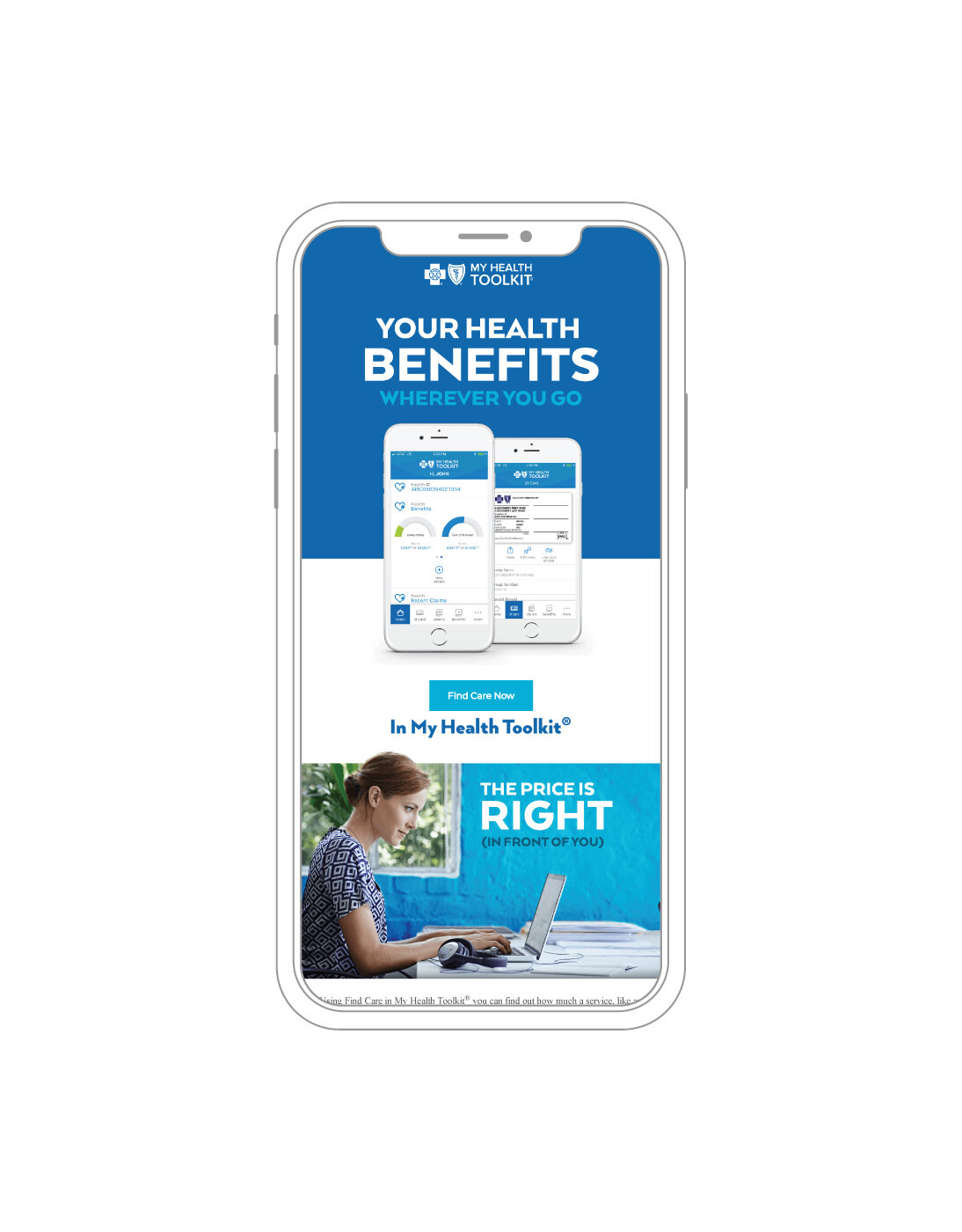
Creating awareness for the My Health Toolkit app was about a couple of key things. First, obviously, it was about getting it noticed. Secondly, it was about letting people know that the app based on their online Member Toolkit is up and that it is solid. Tying the app back to the BlueCross BlueShield family with humor and design was also crucial.
The Concept
If you build it they will come. Using the Toolkit name as inspiration, our team developed headlines to spark interest and speak to the app benefits and what BlueCross BlueShield of South Carolina was doing for its members. Through simple, clean design we made it easy for consumers to quickly understand the utility of the app and encourage downloads. An overview video explaining how the app works was also developed to further push engagement and awareness.
The Results
In the first two months, the My Health Toolkit app had over 25,000 downloads and a 4 star rating in the iTunes store.
Downloads and ratings have continued to remain steady, so much so that we were asked to also help develop campaigns for Blue CareOnDemand and Find Care.

Motion in the Ocean.
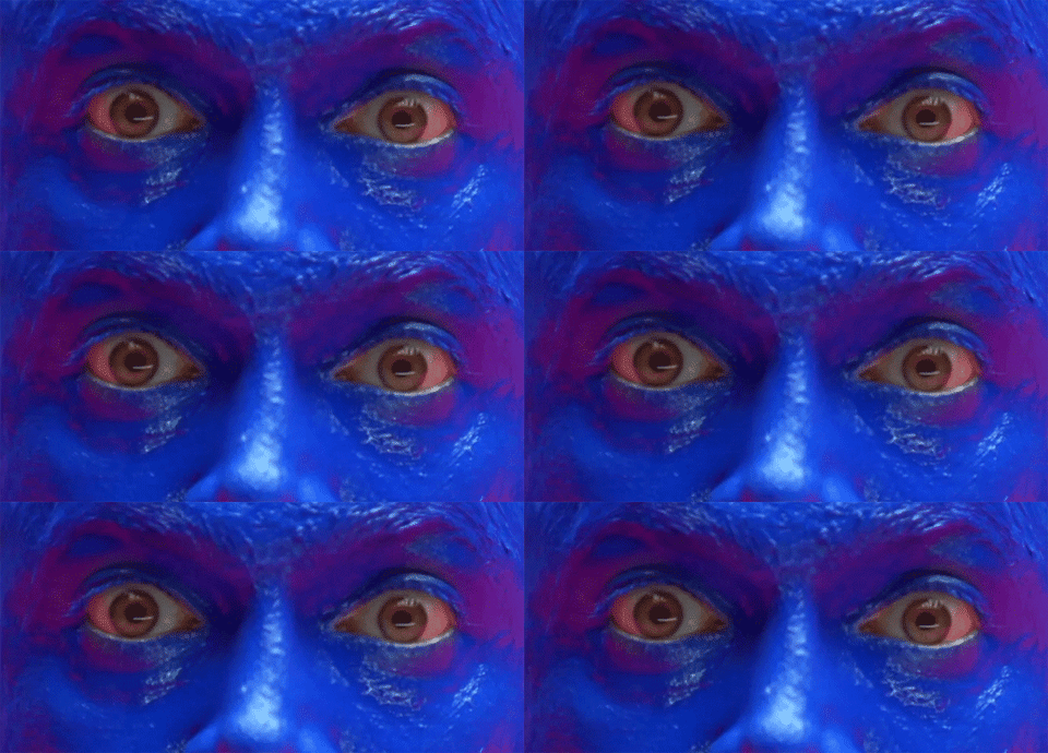
Explainer videos can typically be tough for the average viewer to tolerate. Often tedious and jammed with information, creating something people will watch is always a challenge. For BCBS, we used a unique animation style, perspective and background (along with a little humor) to keep the attention of our audience.
Tools of the Trade.
The Campaign worked off very shot, clever turns of phrase related to key benefits, often including a nod to the name of the application.


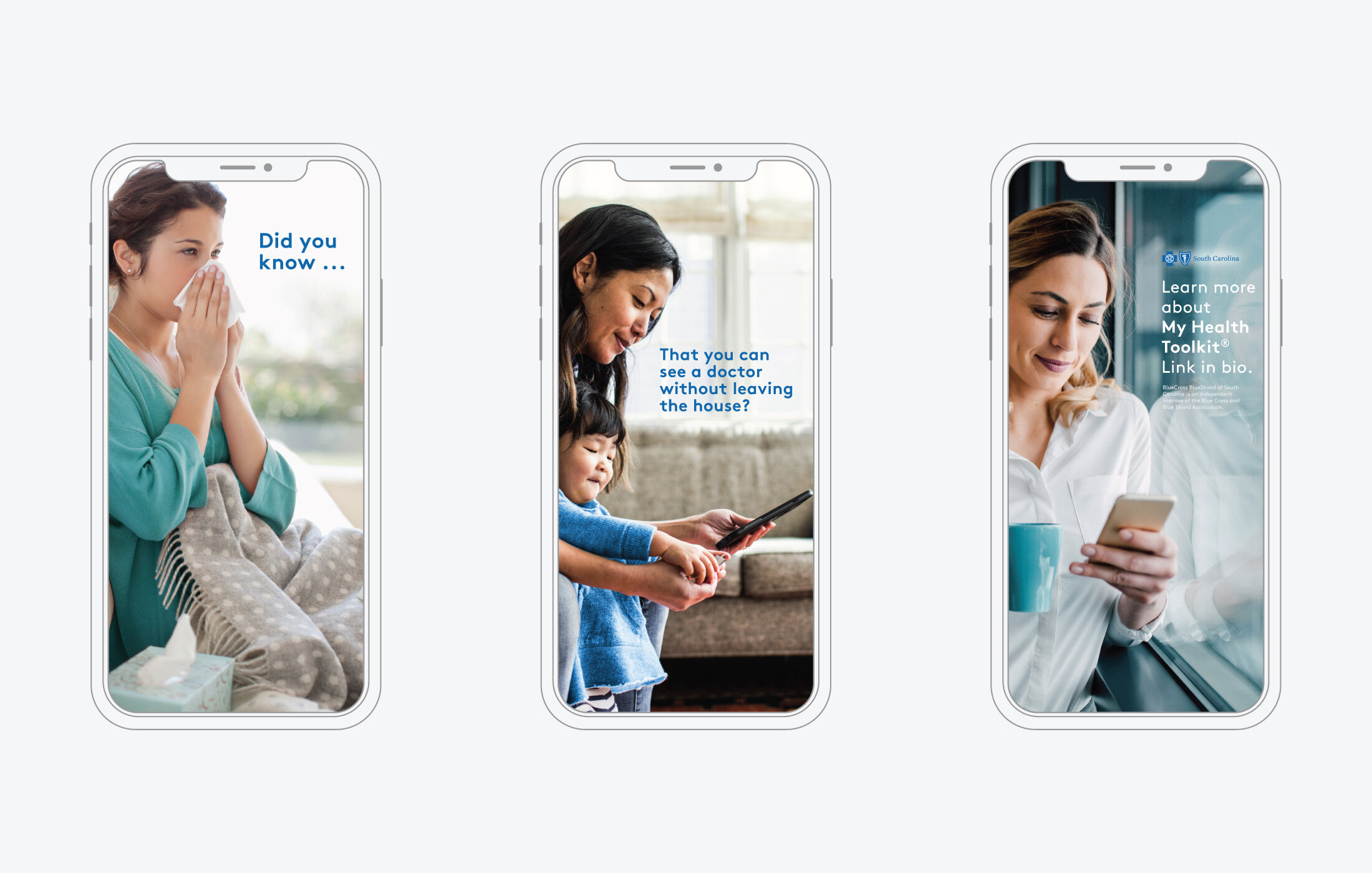

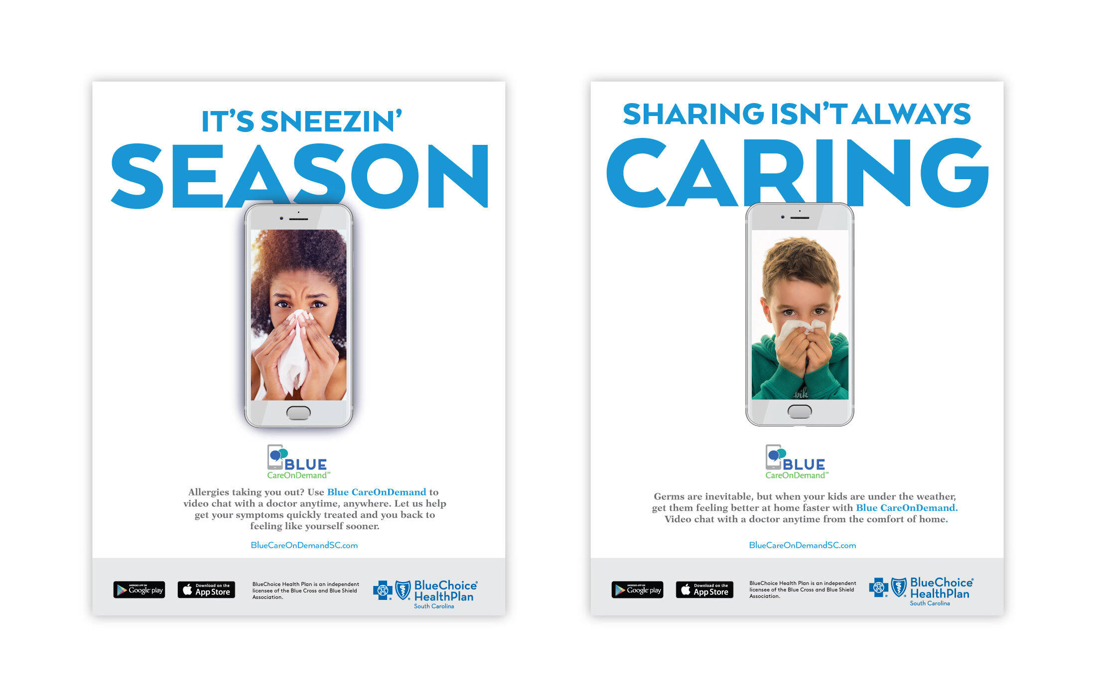
‘Tis the Season
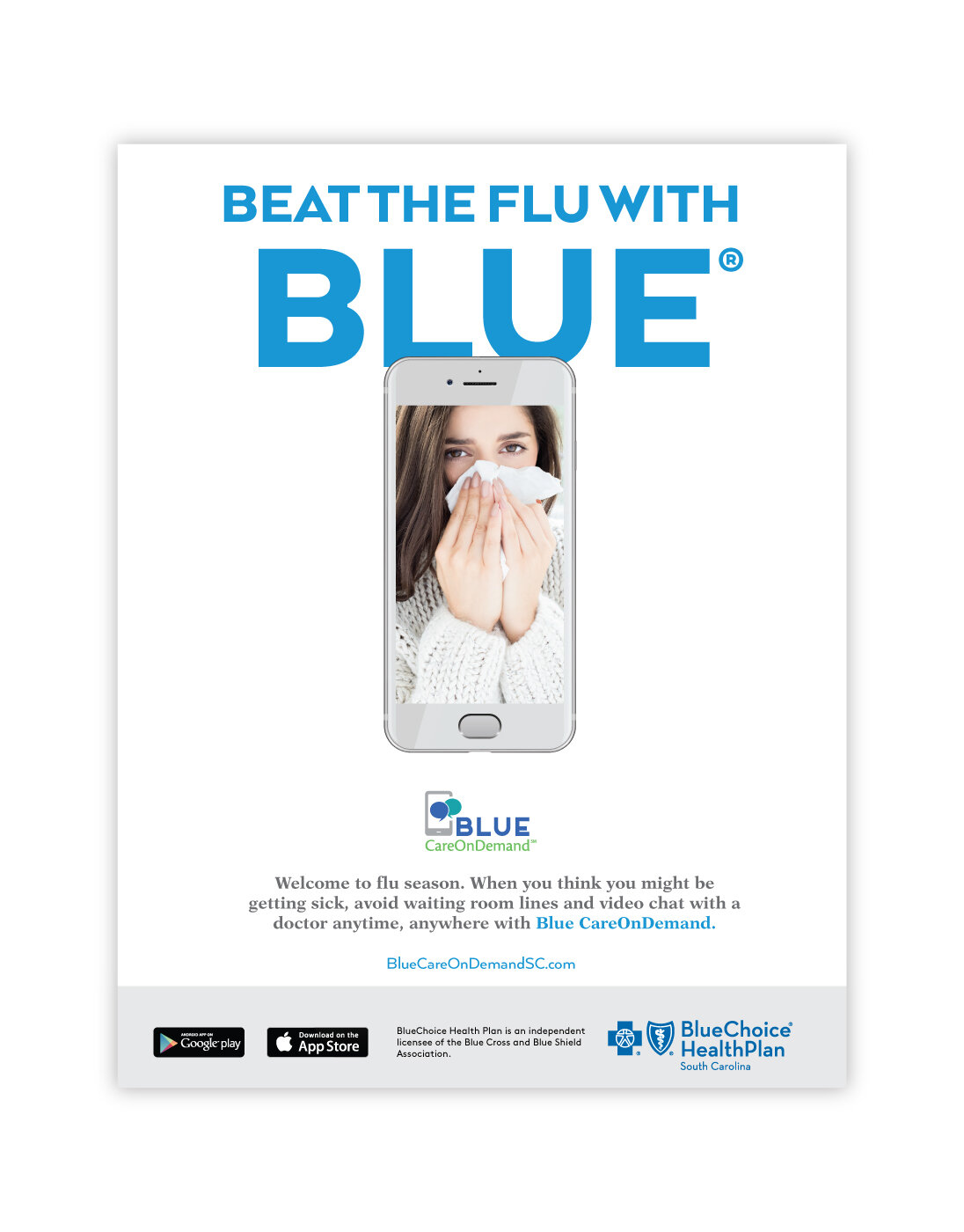
The general flexibility of the campaign allowed us to turn our concept around several unique opportunities. One was flu season, a big one for anybody in healthcare.
The Takeaway
Finding the right eyeballs and transfixing them. That’s what it’s all about, right?
Thoughts on the project.
“Working with the BlueCross BlueShield of South Carolina team was a true partnership. Because of their expertise, fun culture and willingness to be different, we were able to develop an engaging campaign and launch it through strategic B2B and B2C tactics. Their understanding of the market and smart creative allowed us to gain the attention and adoption we needed from members to meet BCBSSC's goals.”
— Christina Tucker / Director, Brand Strategy & Development
“It’s awesome to work on a project with such a large audience and equally large expectations. Delivering some pretty great results is not a bonus, it’s the whole point.”
— Daniel Stewart / President & COO
“Personally, I love that our partners went with this concept. It was unique for the brand, yet brand-appropriate. Not your run-of-the-mill healthcare marketing stuff.”

