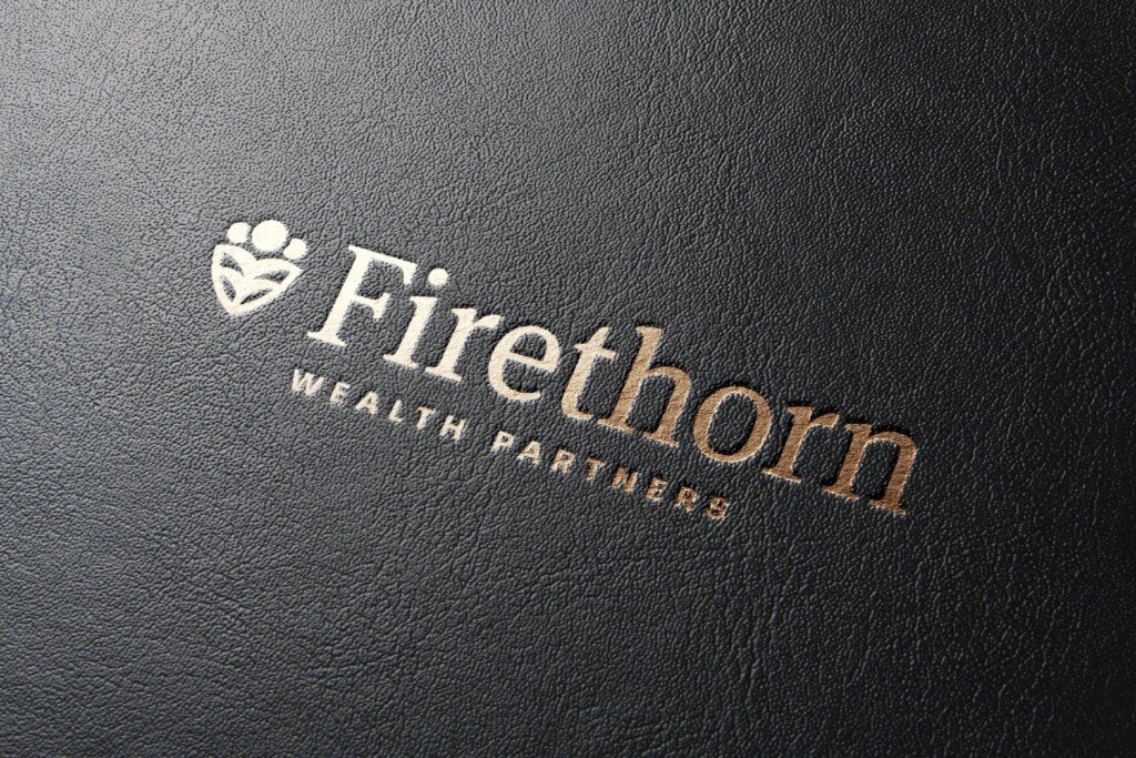
Firethorn Wealth Partners
Firethorn Wealth Partners look to Wier / Stewart to develop new brand identity and microsite.
One of the greatest things a new business can do to help meet their initial goals is to come out of the box with everything about them squared away. A smart, engaging identity and solid web presence automatically lends the new venture legitimacy, a major hurdle for a startup company. Looking on the level in many ways means being on the level in the consumer's mind. And, with years of experience in wealth management, Firethorn is definitely that.
The Firethorn
Found throughout the Augusta area and often used as a hedge, the firethorn represents the two major offerings of the new partnership: growth and protection. The red of the berry symbolizes the passion of Firethorn's ownership.
Fired Up.
It is crucial that Firethorn’s identity immediately convey the company’s superior quality and service, and connect with clients seeking transparency, tailored stewardship, and an alternative to larger financial houses where they may feel neglected. The mark conveys our attitude of guardianship toward customers’ resources, while being approachable, and implies an abundant future. The key tenets of protection and growth are conveyed throughout the brand, and the identity is progressive, yet classic enough to remain fresh for years to come. In Firethorn, clients from all backgrounds will find the financial coach and partner they’ve been seeking.
The Challenge
Established, yet appealing to a new generation of client. That was the challenge in designing the identity for Firethorn. We also wanted the mark to be a departure point for the partners to explain the benefits of what they do. Our solve was to look to their services and symbol.
"Working with the team from Firethorn was a pleasure. These guys are great at what they do, which is why so many trust them with their money and future. The best part? They trusted us completely - a perfect client partnership."
Stacie McBride / Account Coordinator
"With the new branding for Firethorn, we were given the flexibility to build something unique. Adding in parts of their identity throughout the page helped us tell their story with cohesion. Using some of the latest web technologies, their site features some simple and clean micro-interactions to keep some of the extra content hidden until the user wants it. "
Aaron White / Developer
Results
Firethorn has hit the ground running. With lots of positive momentum since their debut two weeks ago, they're off to a great start. Side note: technology is wonderful. We launched their site from the beach.


